Stelo by Dexcom
Stelo by Dexcom launched in August 2024.
Designed for Type 2 diabetics, the Stelo biosensor (or CGM, continuous glucose monitor) and its companion app (iOS and Android) is designed for Type 2 diabetics to manage their health.
Stelo is an OTC product and thus will be available to all people over the age of 18 looking to improve their metabolic health.
Stelo won Best Health Tech in the Verge Awards at CES 2024.
Team
Mackenna Lees: Senior UX Designer
Stakeholders: IOS/Android development team, Regulatory team, Product
Quick overview of CGM tech
Continuous Glucose Monitoring + Diabetes
A continuous glucose monitor (CGM) is a wearable Bluetooth sensor with a very small needle that goes into the skin. Via Bluetooth, the sensor communicates glucose levels to a paired companion app on a smart device. The device measures glucose within subcutaneous fluid (NOT blood) just beneath the skin.
Dexcom G7 is an example of a CGM currently on the market that requires a prescription.

Dexcom Stelo released in August 2024, to address the Type 2 market.
Type 2 Diabetes
…is usually diagnosed later in life, and is more progressive.
Type 2 means your body is inefficient or resistant with the insulin it already has. This is a progressive illness, and that inefficiency varies with the progression of the disease.
Dexcom currently does not have a Type 2-specific product on the market. The current flagship product (G7) has many features Type 2 Diabetics don’t need.
At Dexcom, our Type 2 product is Stelo.
Some type 2 Diabetes need insulin, but most manage their Diabetes with diet, exercise, and with Stelo CGM.
Stelo does not have alerts (low or high)
Stelo has a tight glucose threshold to keep in-range more of the time
Stelo has reduced notifications and noise overall
Type 1 Diabetes
…is usually something you are born with or diagnosed with early in life.
Type 1 means your body produces little or NO insulin whatsoever; insulin is what our body needs to counteract the sugars produced from consuming carbohydrates.
Without insulin to counteract the sugar, sugar runs rampant through the bloodstream. Type 1 Diabetes typically need synthetic insulin via injection.
At Dexcom, our Type 1 product is called G7.
G7 CGM keeps many Type 1 Diabetics alive with continuous monitoring, loud alerts for high and low glucose, and a high threshold that can be set custom.
What you’ll see here
I am a UX Designer (not a UI Designer) at Dexcom, so the final polished UI does not have my name on it.
What you’ll see here is all my technical, functional UX work, that was presented to dev + UI for technical handoff.
Technical Design Reviews
Wireframes + Flows
Branding Explorations
Technical Design Reviews

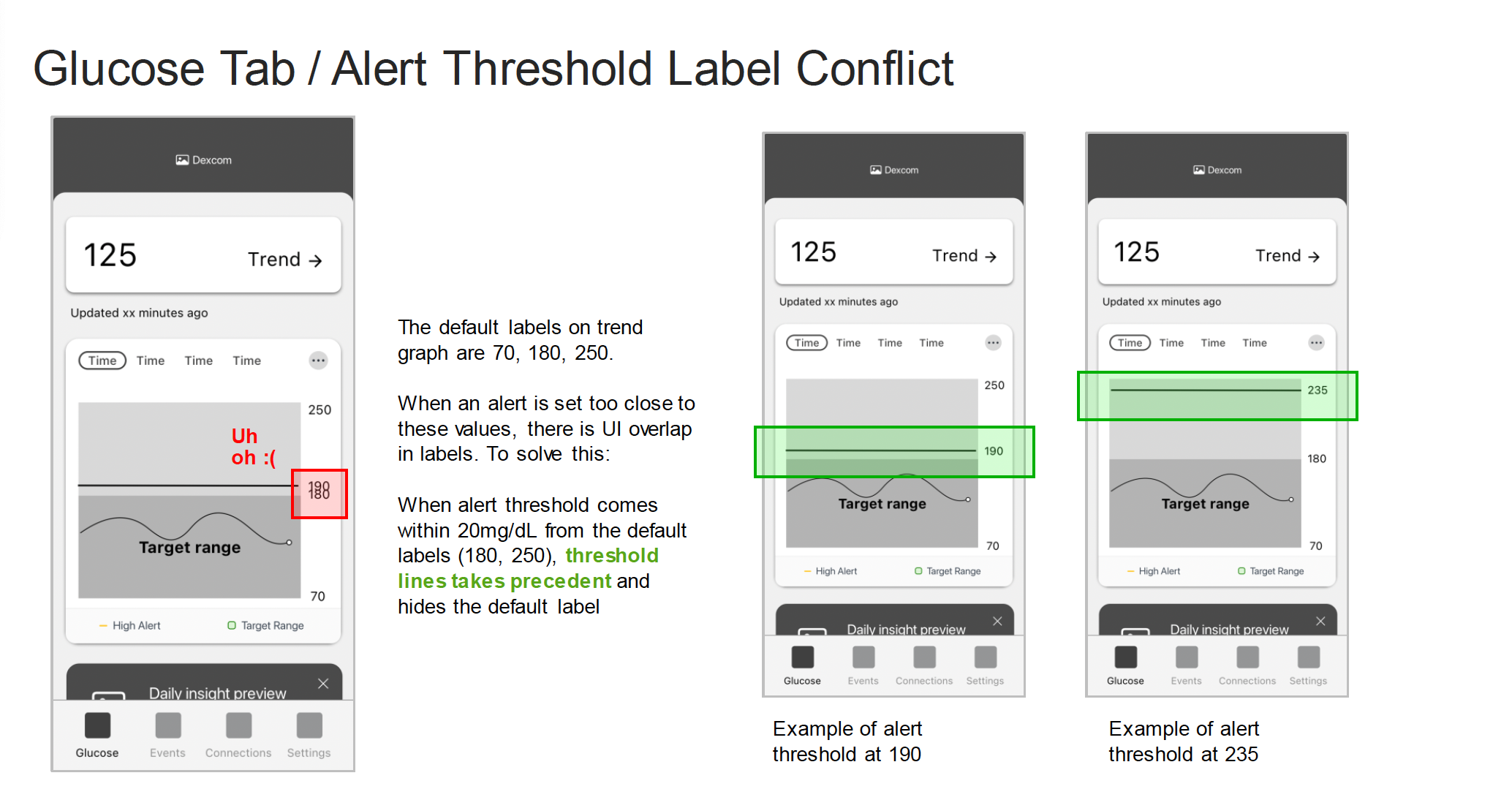
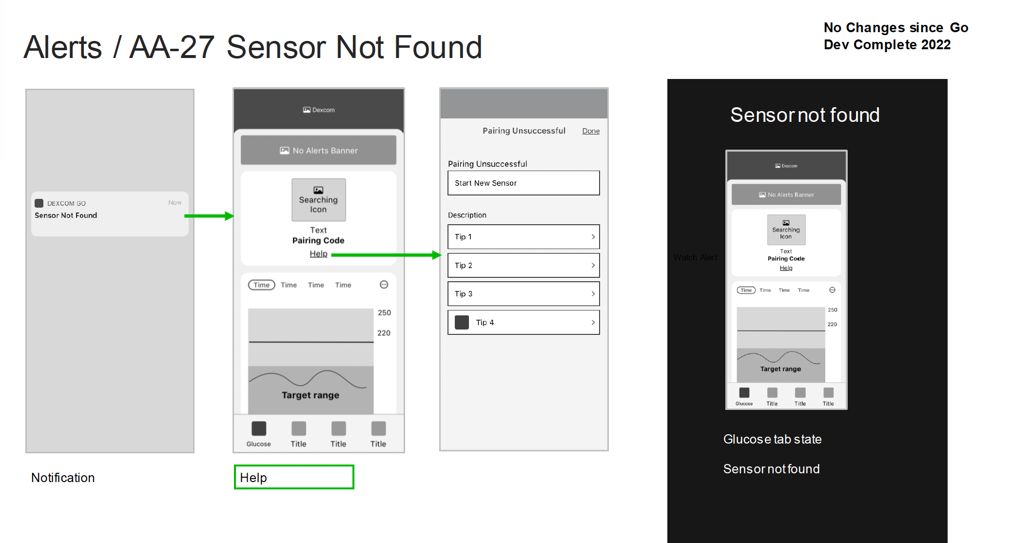
Level-setting slide for attendees of a UX TDR — Technical Design Review.
What is a Technical Design Review?
At Dexcom, formal UX spec is handed off via UX TDR — Technical Design Review —presented via slide deck to deliver features to product folks outside the general UX/product design team.
This slide deck is presented to the broader product team (Regulatory, QA, Development, Legal) to clarify, gut-check, and ask important questions / make necessary edits. Once presented, the deck is sent out for sign-off and approval, then it is referenced by the Development team to build out features while formal UI is finalized.
Myself and the Associate UX Designer are responsible for delivering and presenting these specifications.
Specs include:
Wireframes
Basic functionality
Error states and considerations
Feature is scoped & handed off to UX Team.
Project Management hands off feature requirements to the UX team to start design efforts
1.
UX Design Process (at Dexcom)
UX Team designs & iterates.
UX team designs & iterates feature list collaboratively (wireframes, flows).
Dev leadership is brought in during late iterations to confirm design viability.
2.
When I do the most work
UX Team presents TDR to product stakeholders
UX presents via Technical Design Review to product team
Regulatory, Development, QA, and Legal are present.
3.
When I present the work
Presentation approval kickstarts UI polish and development.
TDR deck is approved & signed, then moves forward to the UI team and the Development team.
4.
Designing & Iterating (Step 2)
I start the “design” process by writing down some baseline requirements the feature must deliver. For example, “As a user…”
I flow out the feature. Seeing it as a flow state points out breaking points easily, and areas where it may not be easy to go forward or backward. I iterate on the flow until it makes sense, achieves its feature goal, and it has intuitive paths.
I start on wireframes, and get them to a comfortable place that fulfills the flow. Then I bring the wireframes INTO the flow to show the depth of the feature.
I bring my team in routinely; if I have a gut-check question, I hit a lull, or simply when I just want eyeballs on it. My team has final say on if we feel the feature is “ready.”
Crafting & delivering the presentation (Step 3)
The TDR presentation is NOT just for UX eyes! So many stakeholders are a part of the presentation, so it needs to be digestible, have very little design jargon, and easy to scan and understand.
I like to break each feature into its smallest parts for the presentation. A handful of screens at a time, no more.
Show the flow.
Highlight the errors and considerations, usually as their own slide. The team needs to understand where errors can occur and the stopgaps created to help users overcome them.
Highlight any design considerations for the UI team in moving toward polish, and any questions/thoughts around dev implementation that have not been answered.
TDR Decks
The following are examples of TDR slides I’ve crafted to walk through the entire app architecture of Stelo before product launch.
A few key things to look for:
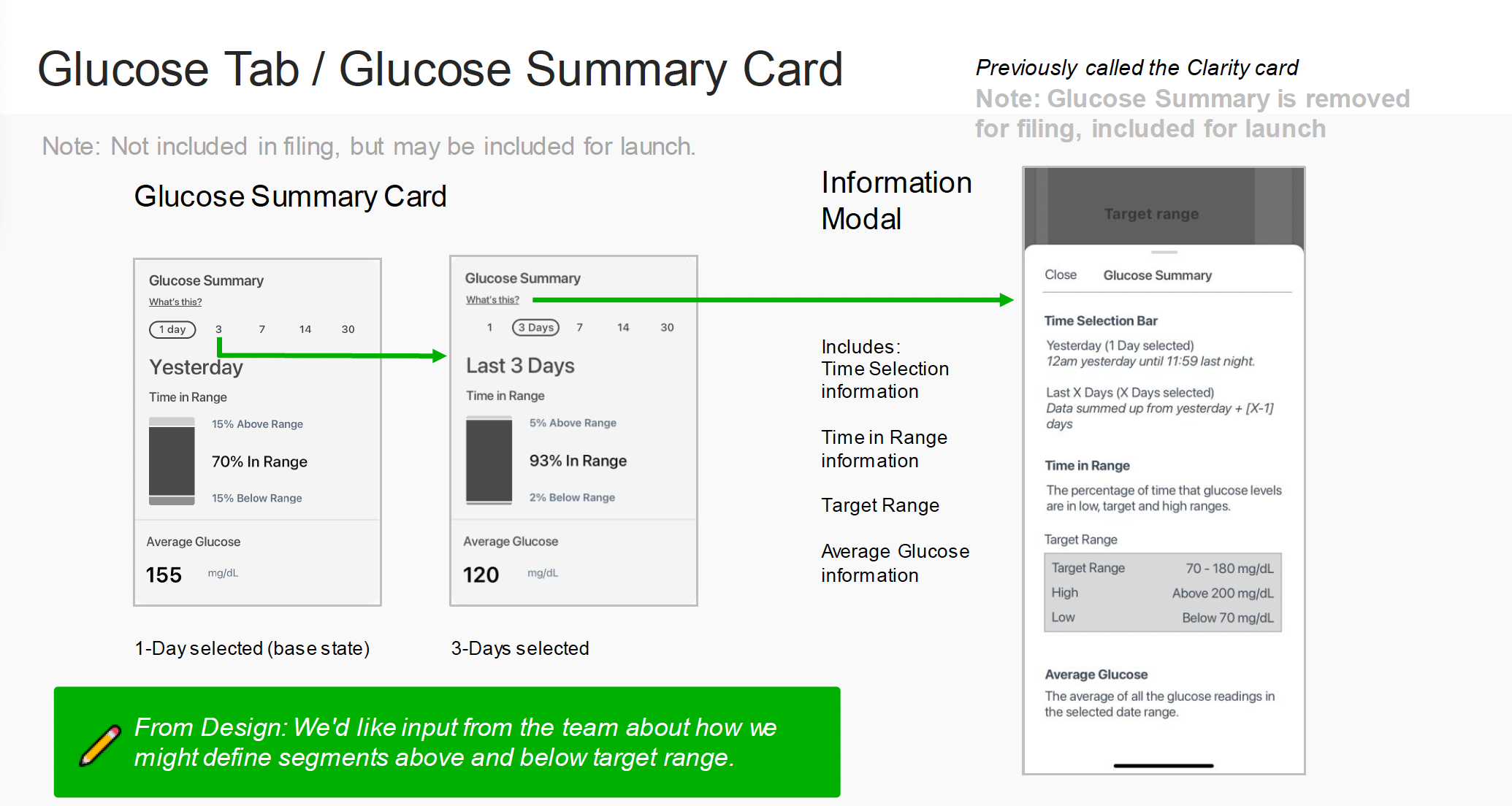
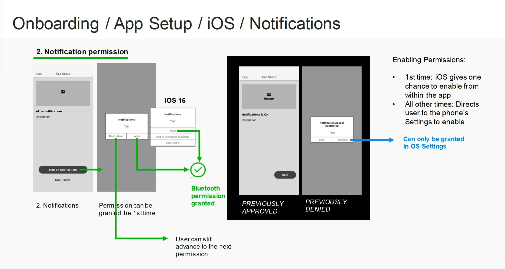
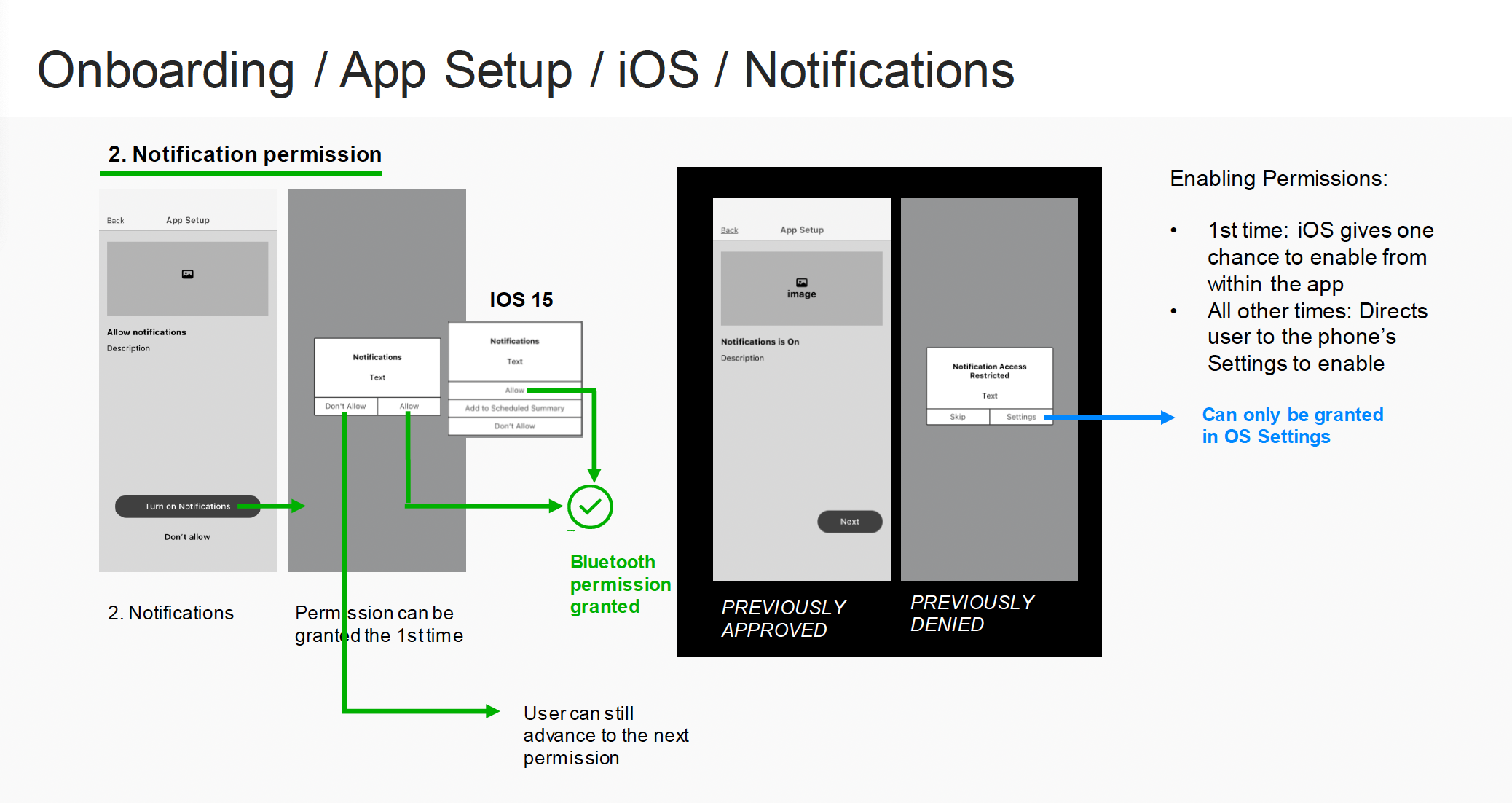
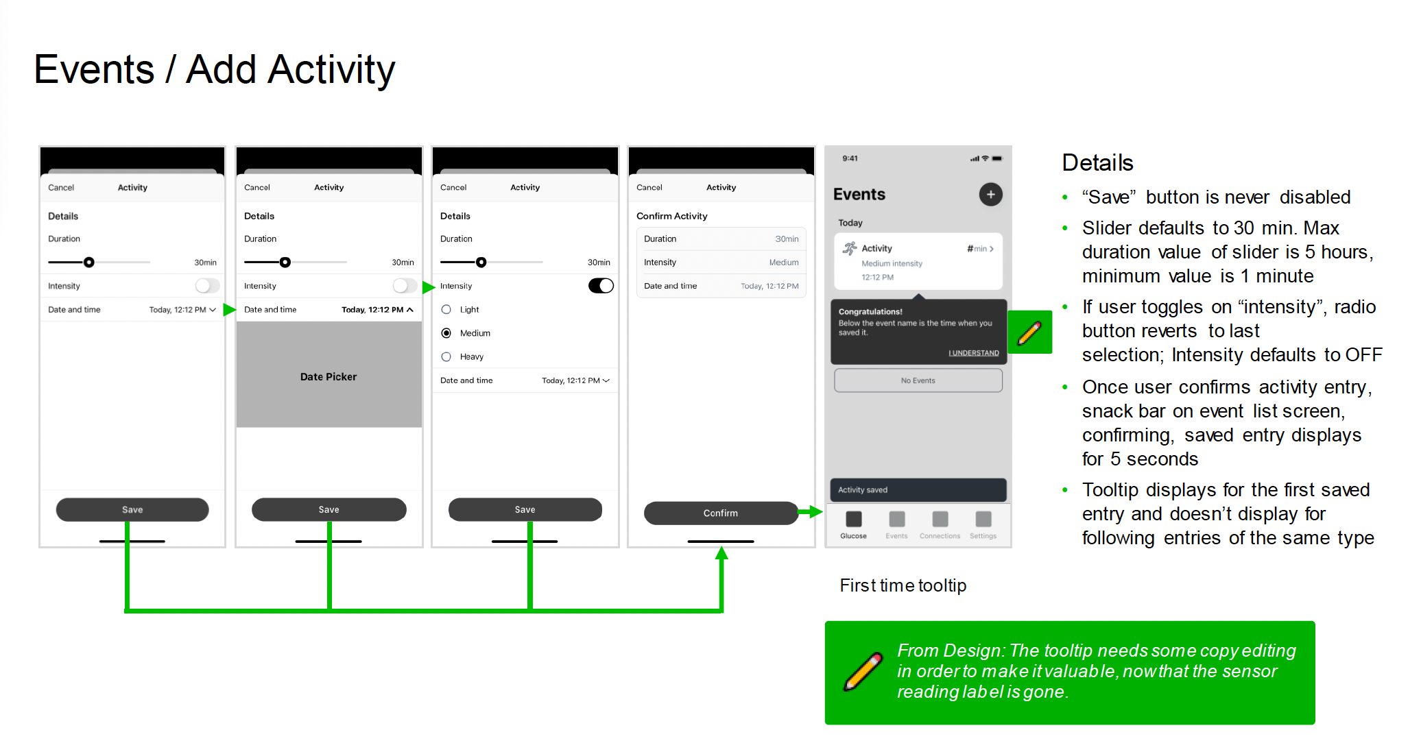
Arrows -> showing general flow within a set of screens
Design Notes ✏️ for thoughts on copy changes etc
Items that have been removed from a past iteration
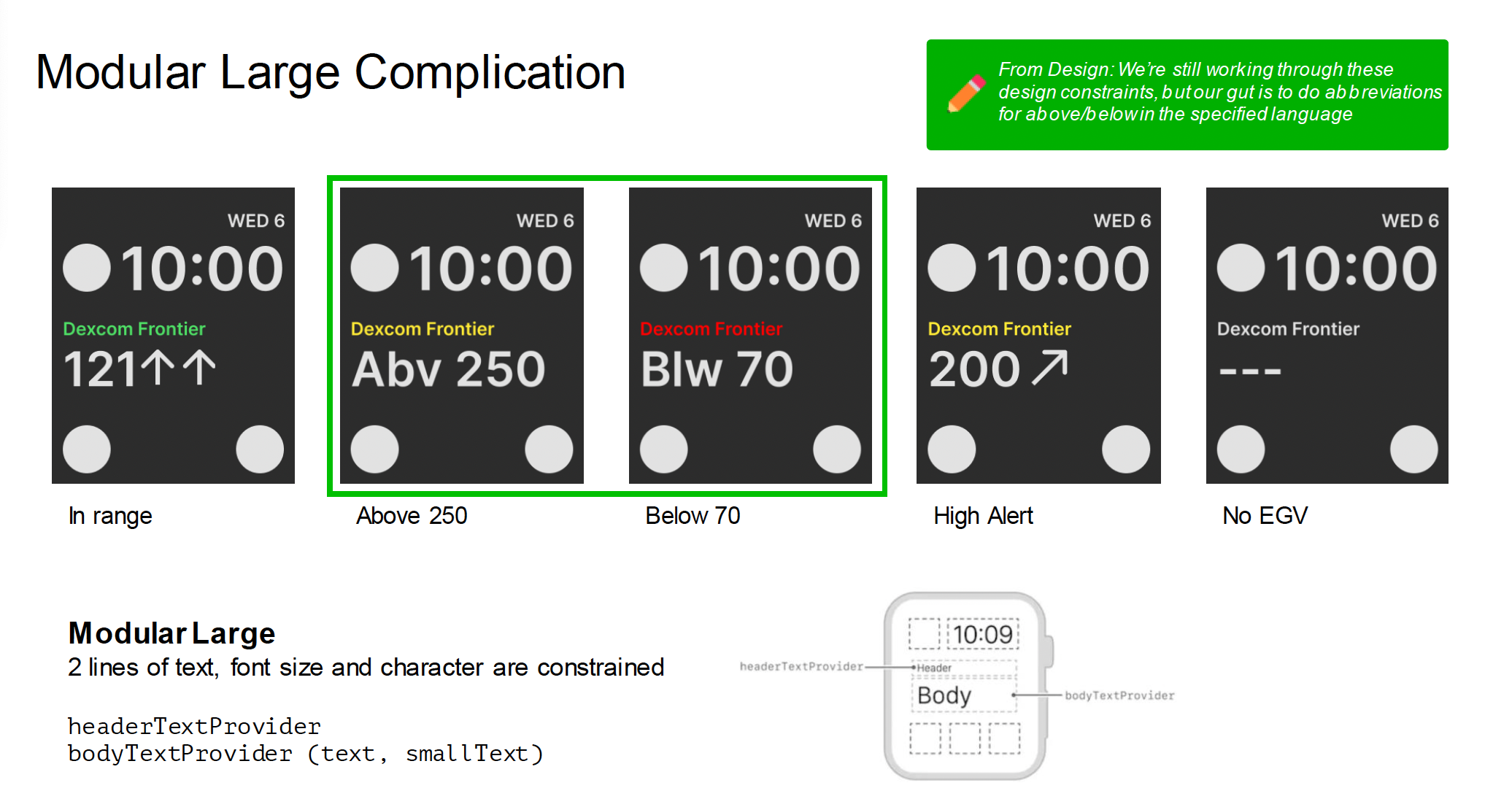
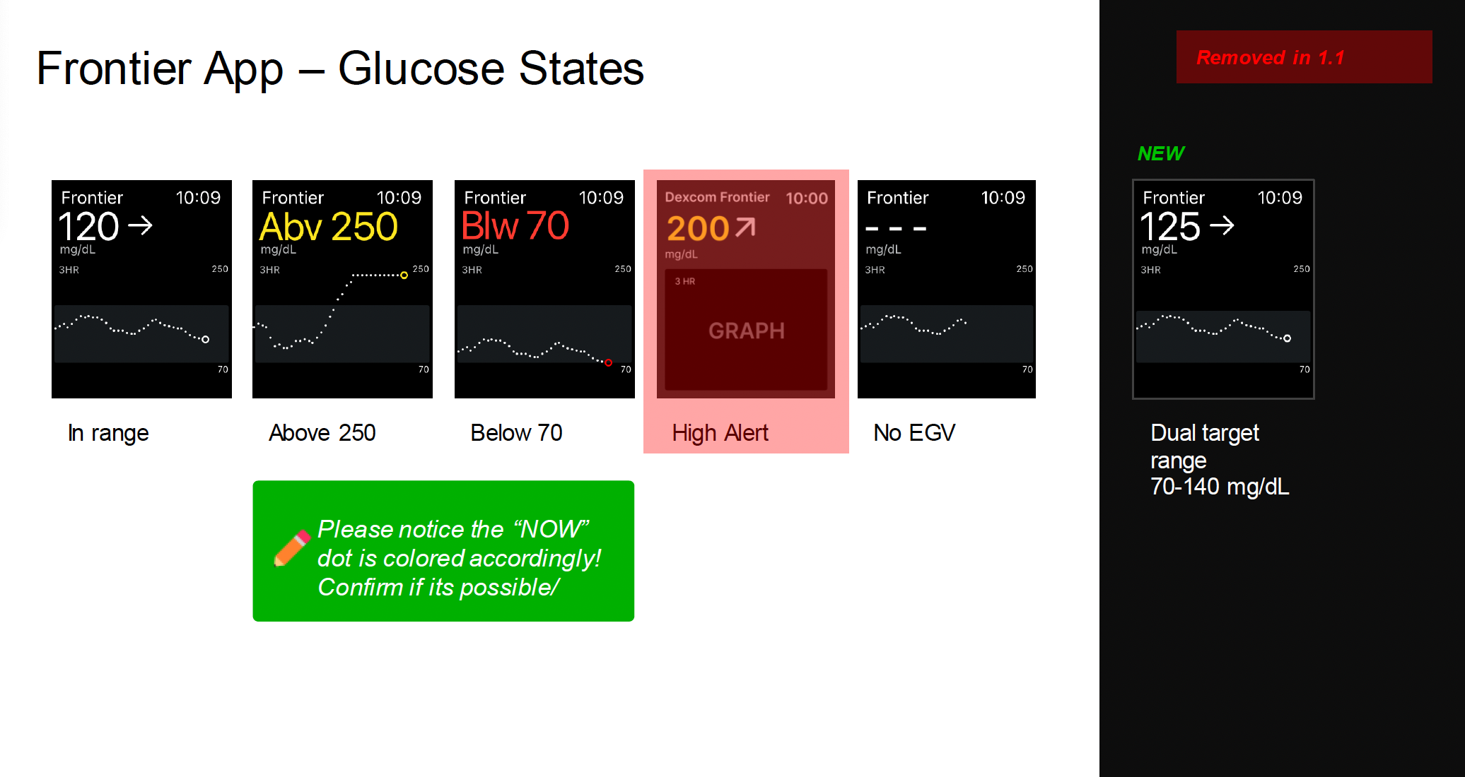
Order of operations (ex. notifications stacking)
Constraints & rules, like limits for a text box
Error states and considerations for error alerts
Other locations this flow appears


2. Wireframes and Flows
Flows for interaction and technical spec
Flows are done in Overflow at Dexcom. They are sorted by feature / by tab.
Why are flows important?
Designing flows show the breaking points of a feature; why doesn’t it continue from here? Can the user go back?
Flows highlight error states and stopgaps in a way that makes them just as important as the happy path.
Flows show the bones of what is going on — there should be no questions about interaction after reviewing a flow done correctly.
Designing a Flow

Connections Tab — Various states of pairing Bluetooth sensor, including warmup, active sensor, grace period (expiring soon, and not active)
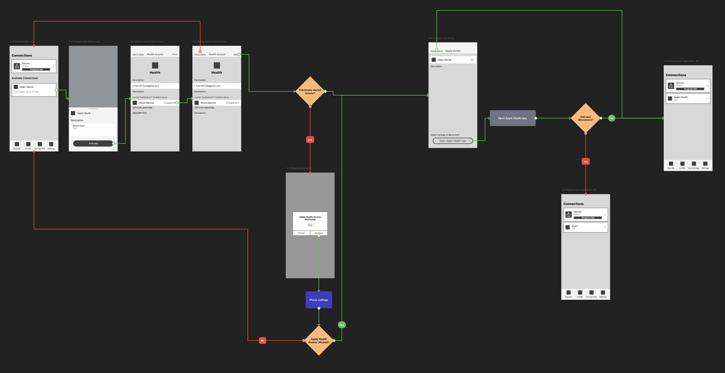
Connections Tab — Flow detailing the states of the tab (this is where the details for a paired sensor live)
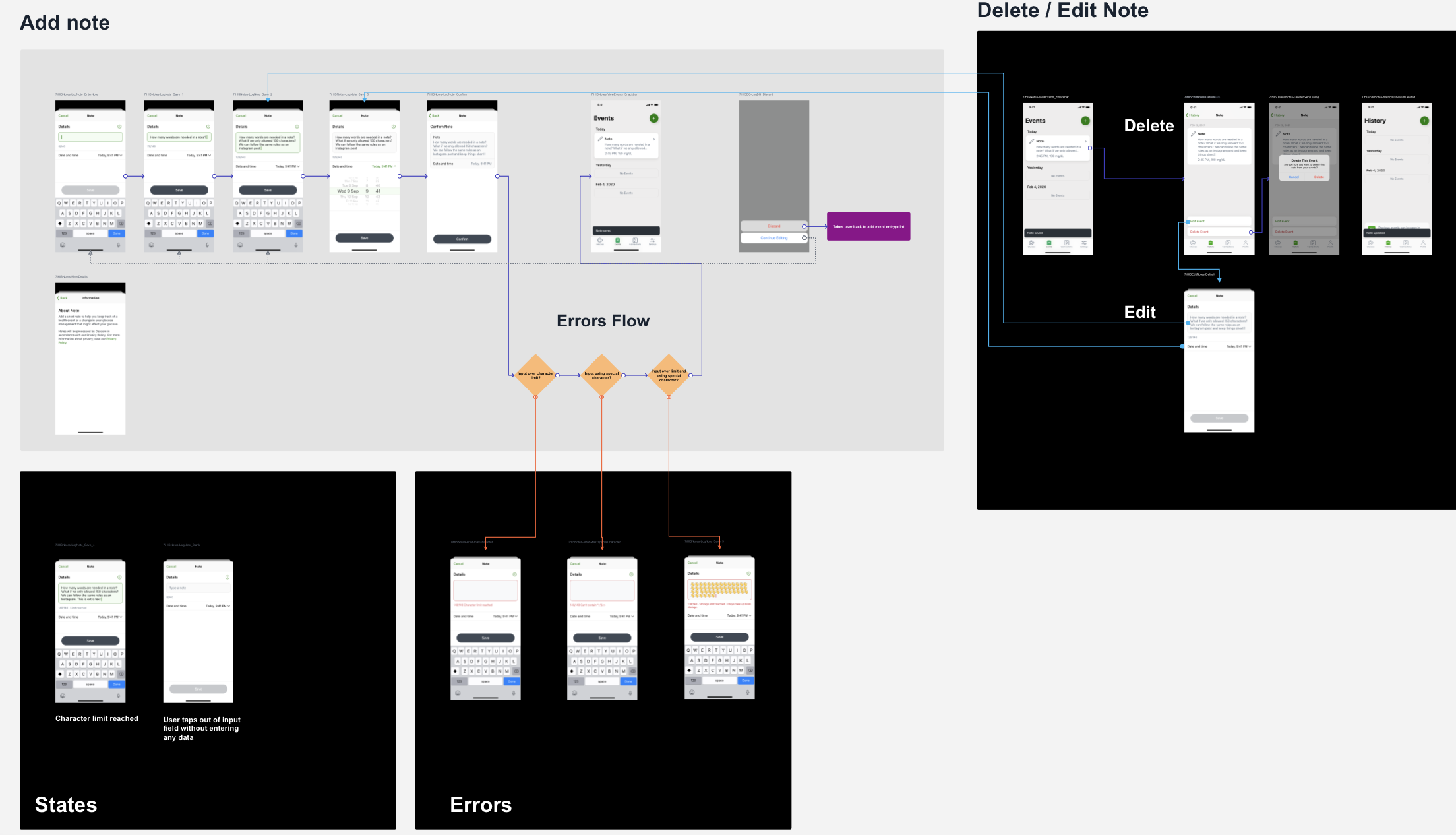
Add Note Flow — Flow details Add, Delete, and Edit Note interactions in the Events tab
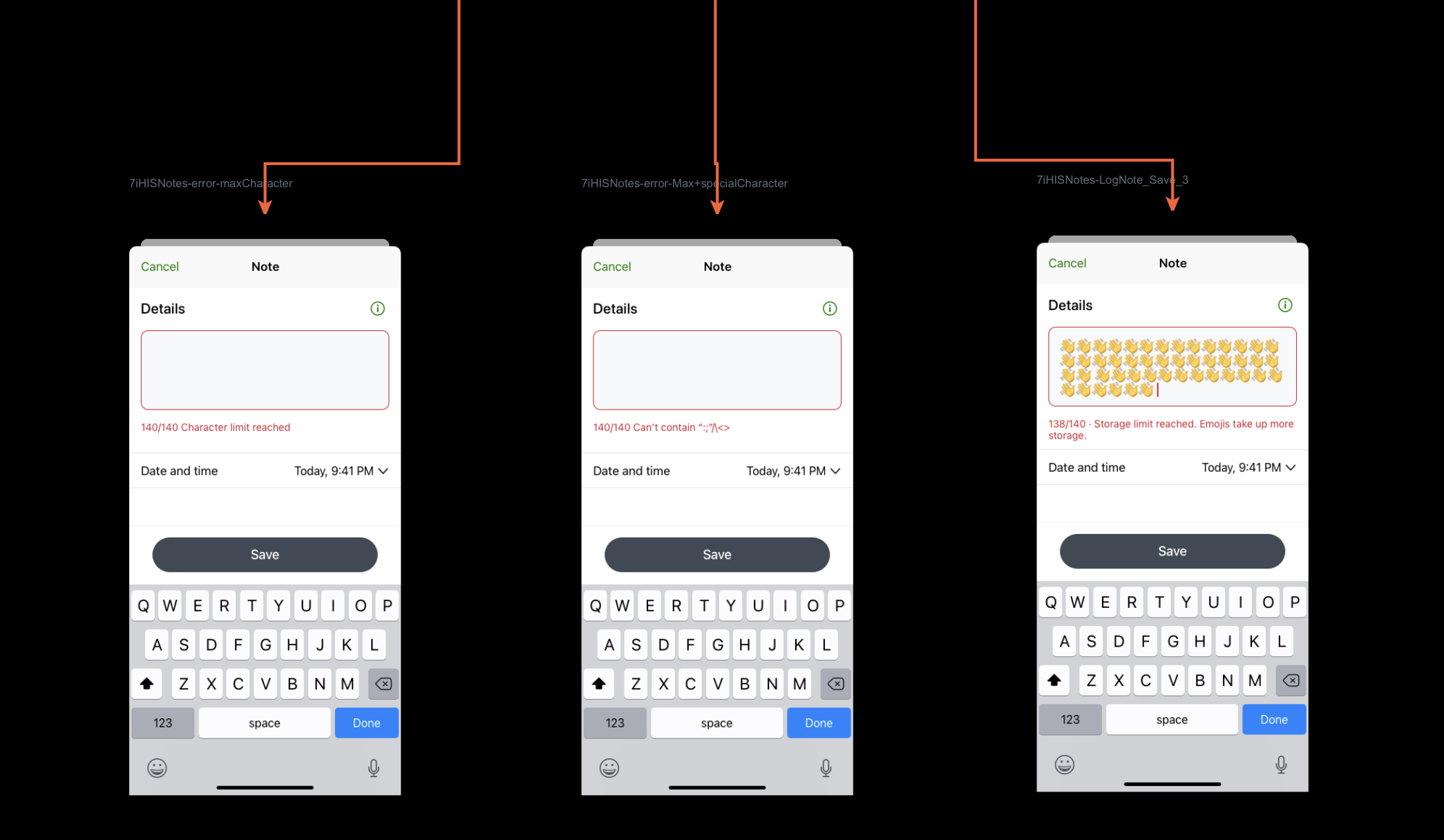
Add Note Flow — Error states
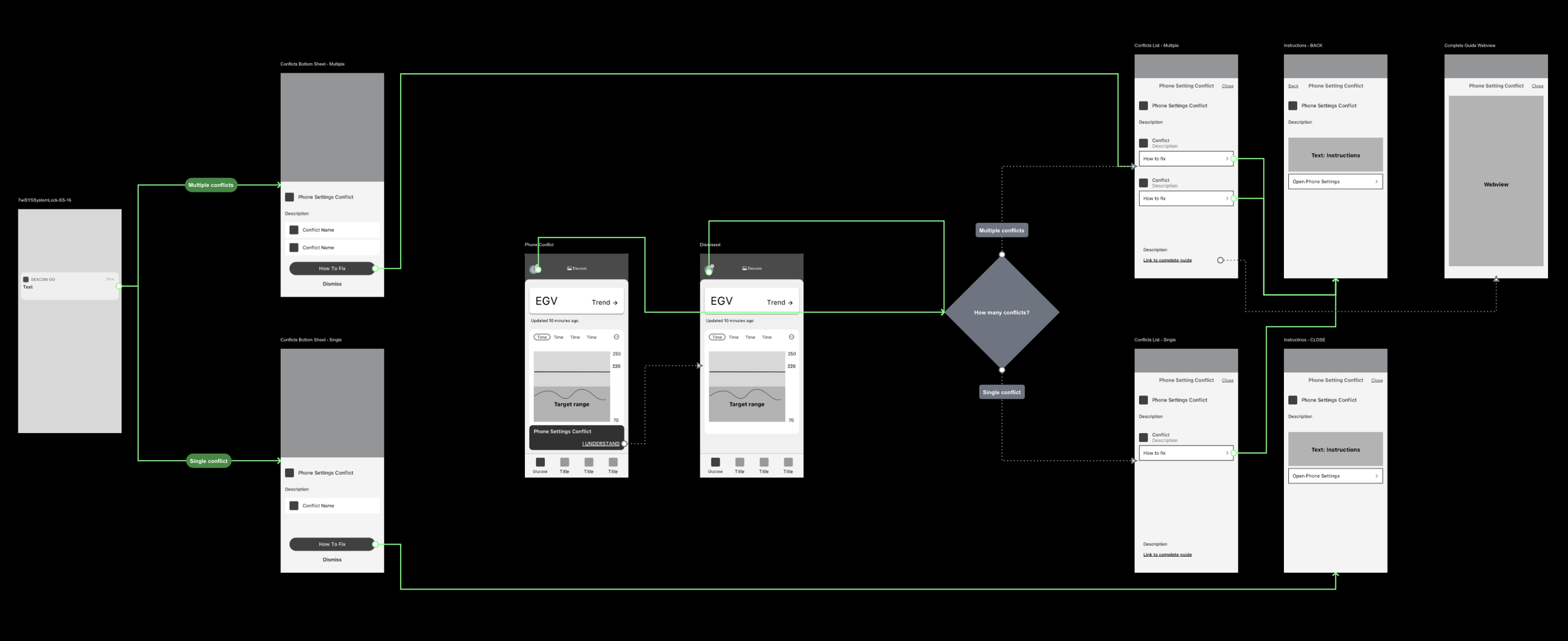
Phone Settings Conflict — User must acknowledge before proceeding with app use.

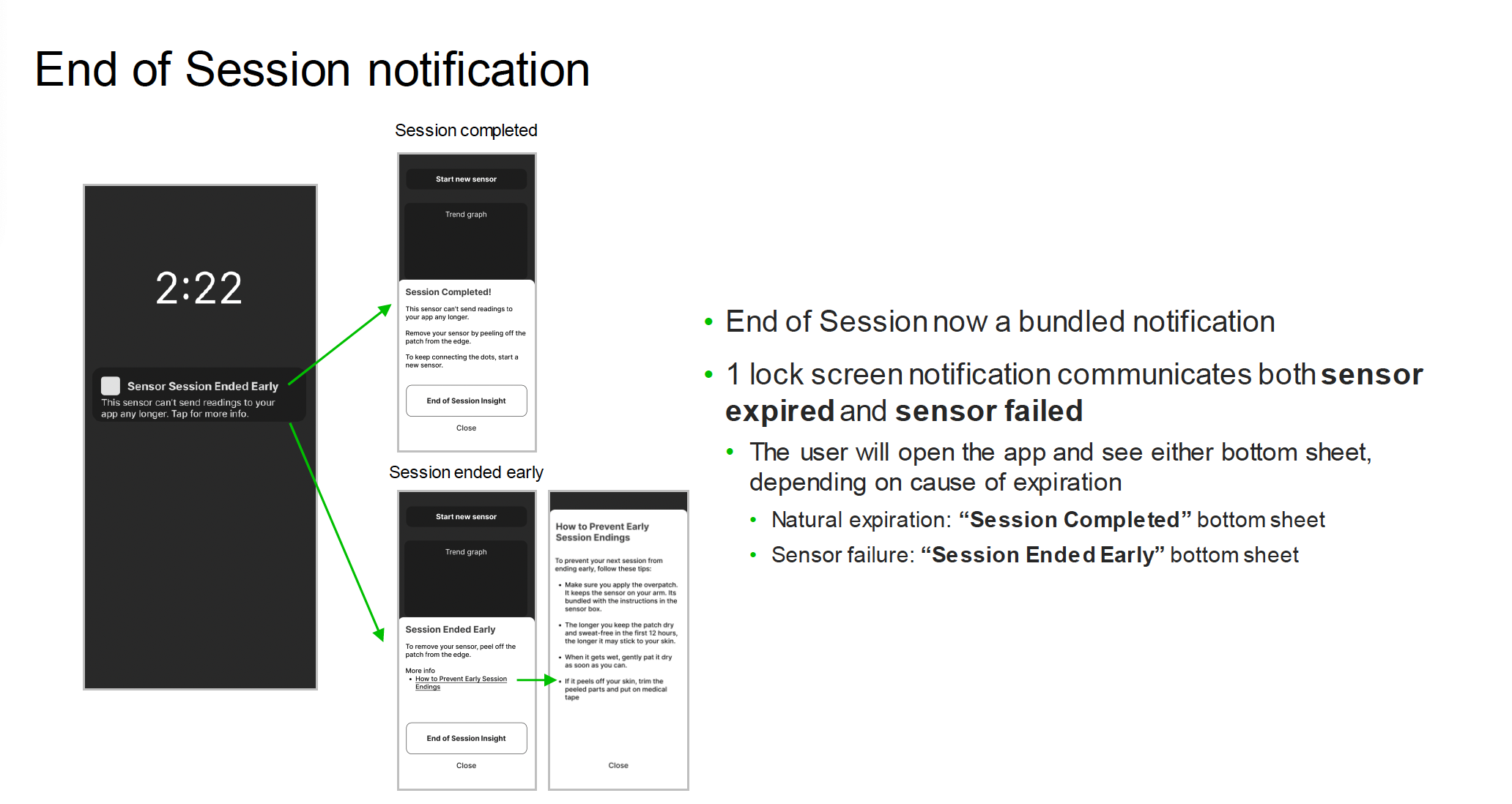
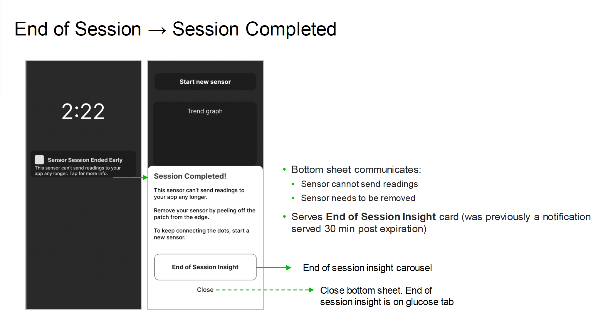
End of Session — notifications communicating sensor is expired / ended, leading to insights about the session
3. Branding Explorations
What do you do when there is no brand, but you have a preliminary color palette and one font?
My team was asked to design 2.0 features to excite Executive Leadership with a “taste” of what was coming for the product brand (still TBD at the time from a branding agency).
We had the product primary font & a rough preliminary palette from the branding agency. Using these, we set out to get to work.

Font pack - Pastiche Grotesque

Color Palette

Poster card example from agency
My process
We had 1 week to design brand new features, create and apply UI elements that feel like a cohesive brand, and turn the features into animations for viewing as a GIF. Work was FAST and thus needed a new process:
I chose to work rough & fast, and forego wireframes. I needed to get the guts of the feature designed while working on the UI at the same time.
Once I had a good foundation, I turned everything into a component. I wanted to make adjustments that were applied everywhere, such as bezeling corners.
I iterated collaboratively with my team, until we had a thumbs up 👍 all around. Collectively we sent our work over to our UI designer to animate.
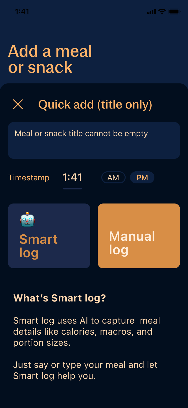
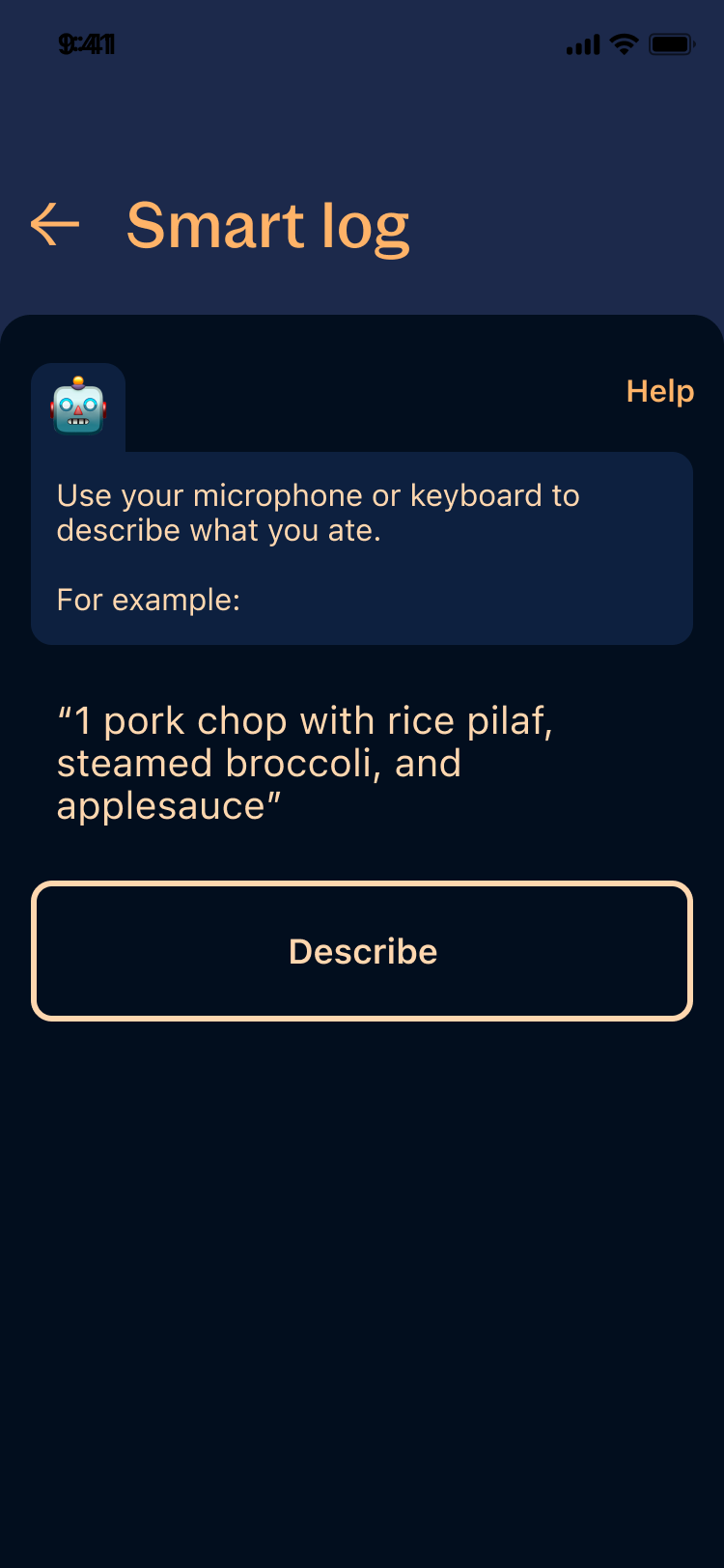
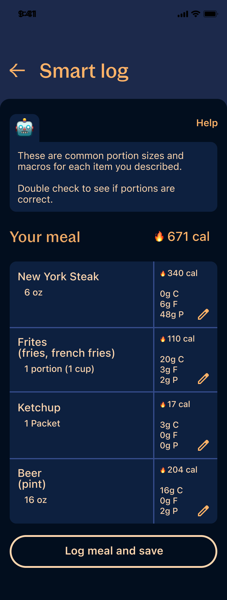
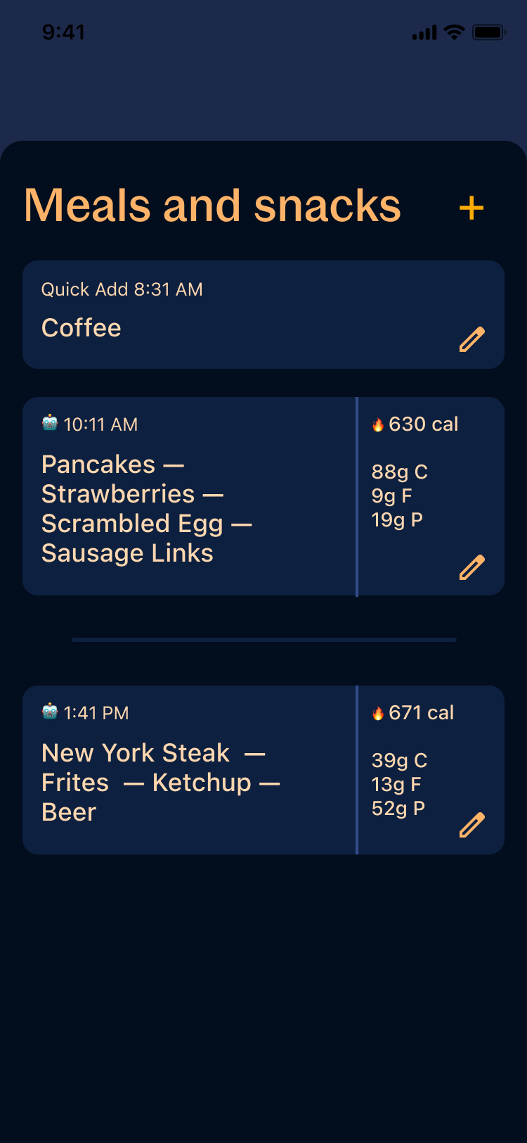
Feature 1: AI Food Logging
Feature must:
Allow a user to log a meal with multiple food items using only their voice
Incorporate smart AI to piece apart and log spoken words (food items) as real, tangible logged items with appropriate sizing, macros, and calories
Allow a user to edit a single food item for adjusting sizing, macros, and calories
Display a full meal in a manner that is still scannable but not the spoken word
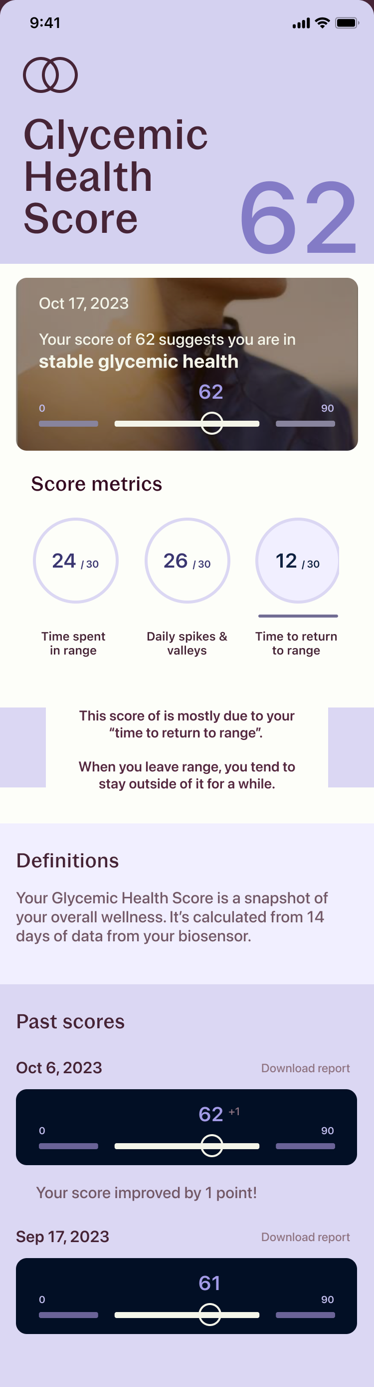
Splash Page - Health Wellness Score
Feature must:
Communicate a score out of 100
Communicate 3-5 categories of health + glucose-related items that contribute to that score
Give the user more information & opportunity to learn more about improving the score
Communicate to the user their past scores and improvement since
AI Food Logging

Colors used

Splash Page - health Wellness Score


Colors used