Custom Alerts for Wahoo ELEMNT
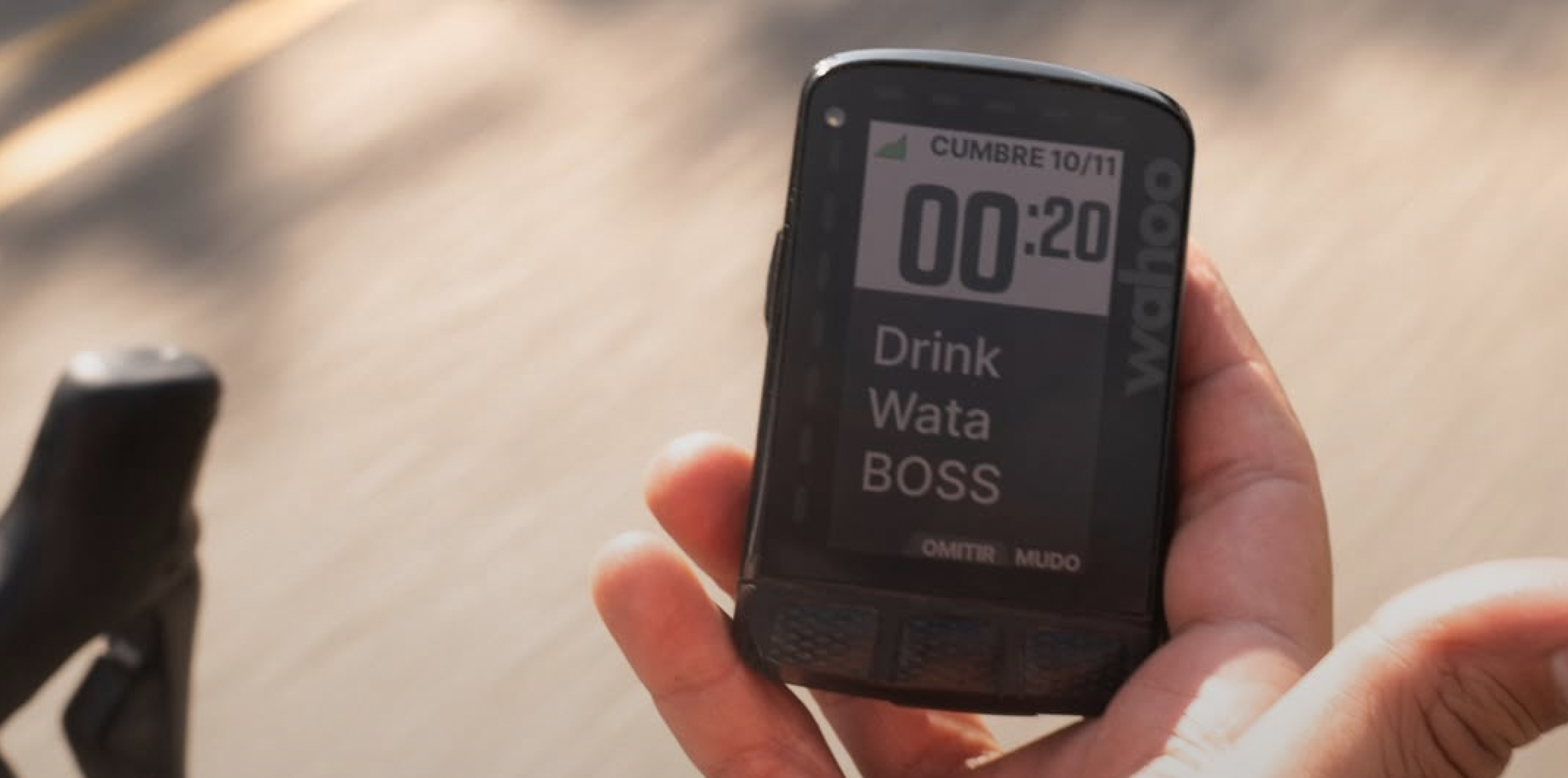
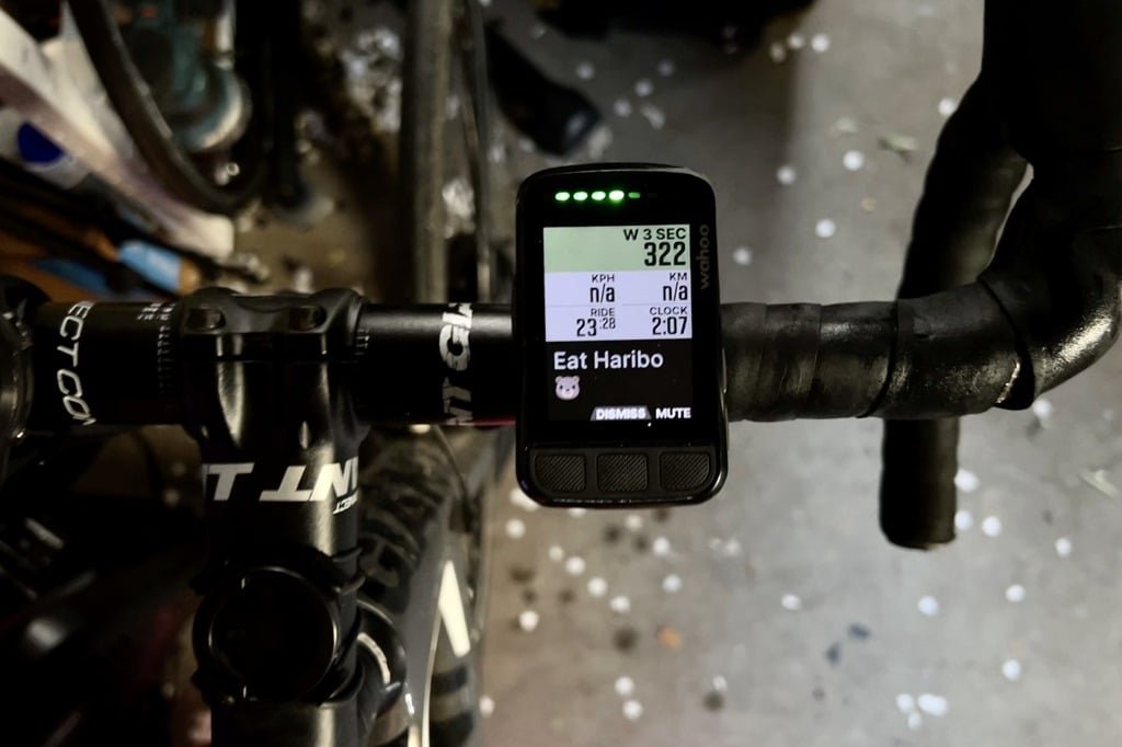
Photo by Rik de Voogd
Custom Alerts allows Wahoo ELEMNT users to send themselves interval-based reminders on their GPS bike computer.
My biggest feature launch at Wahoo, Custom Alerts enables users to create fully-customizable alerts at single or repeatable intervals. Food, drink, fun. Anything you might need a reminder of on the road or on the trail.
In the span of a year, I took this feature from concept to sketches, designs and iterations, tested it ruthlessly with developers and QA, then launched it into the world.
For this case study, I am missing all designs that were in Sketch. That includes iterations.
Team
Product Owner: Megan Powers
Lead UX/UI Designer: Mackenna Lees
Bike Computers Hardware team
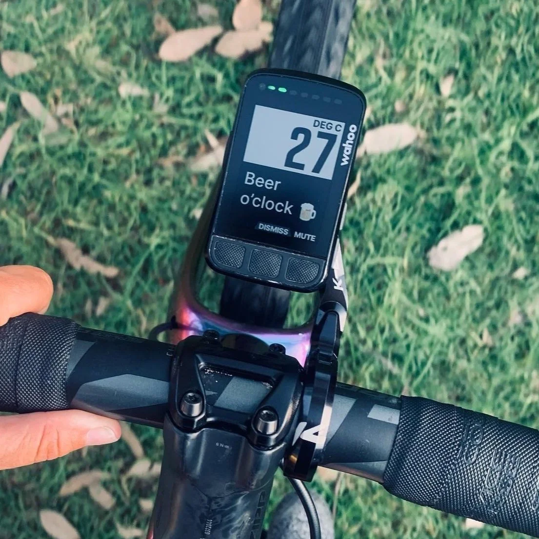
Custom alerts are truly customizable 🍻
Which makes it so great that I’ve seen SO many beer-related alerts in the wild.
About this project
As an ELEMNT user, I want to use the ELEMNT companion app to set up custom alerts to fire every X miles/km and/or Y minutes while I’m riding.
Problem
Wahoo needed to find a way to let users set up personalized alerts/notifications in order to stay up to date with competition in the market.
Early on, this feature needed to support alerts that are time-based, distance-based. Later into the project, calories-based was added.
Example use cases:
(Complex) Every 20 minutes I want a reminder to drink, every 30 minutes I want a reminder to eat, and every five miles I want a reminder to relax my shoulders.
(Simple) Every 20 minutes I want a reminder to drink.
Process
Brainstorm use cases; consider users from casual commuters up to pro elite racers. Think about how I would use the feature in my own training.
Plan for how the user accesses the UI for these custom alerts on mobile—and how they edit, manage, and even delete them. Use existing components when possible.
Dive into the pixels, but first make sure designs flow correctly. Design for the bike computer.
Iterate, polish, test.
The companion app + ELEMNT combo
Set up on your phone, see it on your bike computer during your ride
Workout-specific capabilities on ELEMNT (that users configure on the companion app):
Pair (Bluetooth) sensors
Pick a pre-made planned workout
Choose or make a GPS route to load
NEW Select custom alerts
Brainstorming & Sketching
Use Cases
Early concepts from Wahoo’s product team kind of limited the feature to food & drink. Which is great—and is representative of how the majority of our users will use the feature.
However, if we’re calling this custom alerts, we should enable users to make them TRULY custom and in accordance with their needs. We need to support everything.
After reviewing use cases, I decided the best way to move forward with custom alerts for its initial launch was to include (1) a single-fire alert (happens once and only once ), and a repeatable interval alert (like eating every 1 hour).
These set my precedents for moving forward with the design process.
I brainstormed hundreds of reasons to set an alert for yourself during a ride. These are just a few ideas from that exploration.
“I need a reminder to _____________ (every / once) ______________”
Drink electrolyte bottle
Eat cherry Clif Bar
Eat _____ calories
Relax my shoulders
Put on my rain jacket
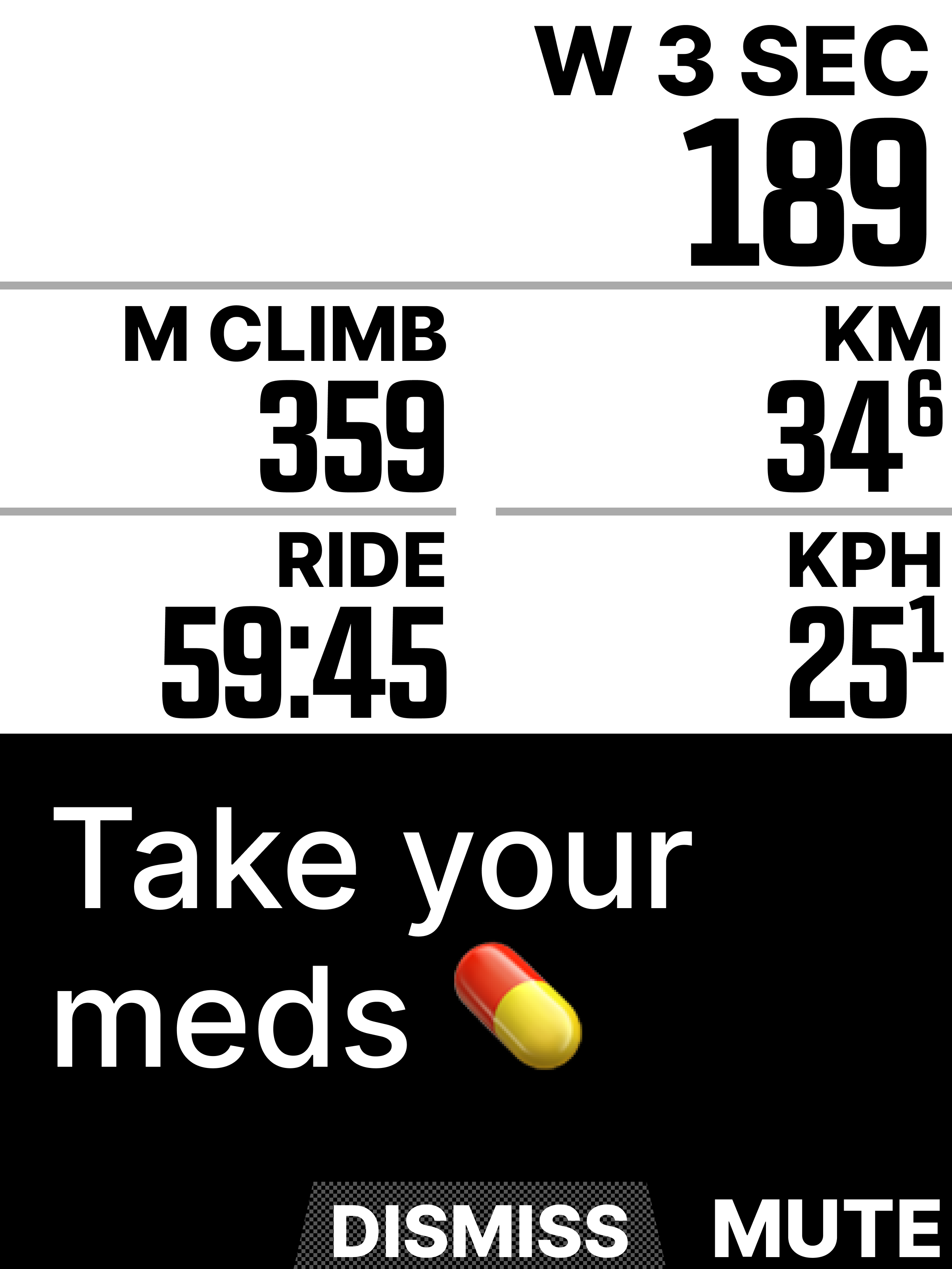
Take my medication
Keep my chin up
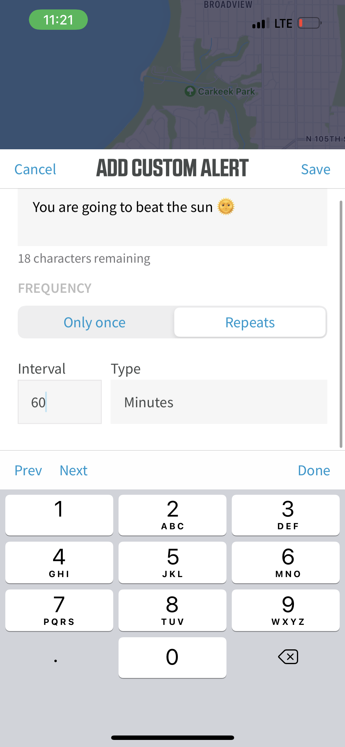
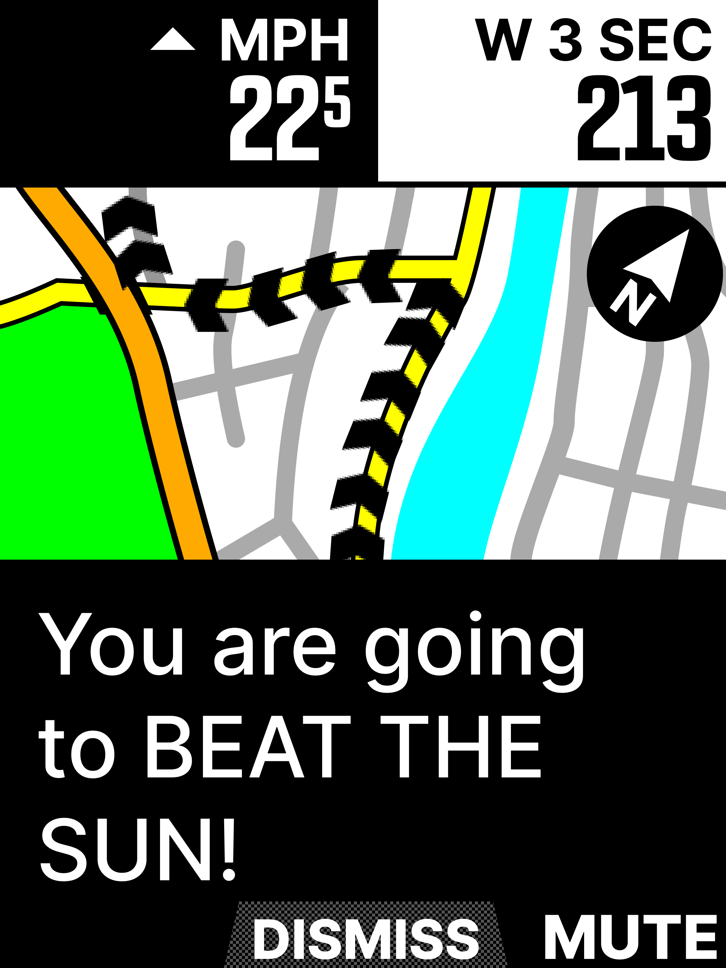
Beat the sun
30 minutes into workout
I see the red barn at mile 56
I burn _____ calories
25 minutes (repeat)
I reach Poulsbo (~3 hours in)
At 9am sharp
On the hour
12 hours into the race
Sketching and ideas
For a while I found myself sketching custom alerts as situation-based events that were assigned to a ride type. So many of the use cases I came up with could be determined as hyper-specific. For example, alerts needed during a race are/can be different than alerts on a casual 2-3 hour ride. The needs are different.
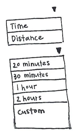
Many of the sketches I was doing were two-factor:
Playing with where the bulk of this feature sits in the existing companion app structure
Determing which patterns felt right for configuring an alert


Early kinds of dropdowns
I was hesistant (at first) to make the value truly custom and wanted to offer presets to conserve the user’s time.
Designs in pixels
Unfortunately I am missing examples of my highly iterative designs for this project (I was laid off). What you’ll see below is live implemented in-app with a walk-through of iterative process and decisions
Companion app set-up of custom alerts includes…
Add an alert
First time UX
Components of the add modal
Alert Management
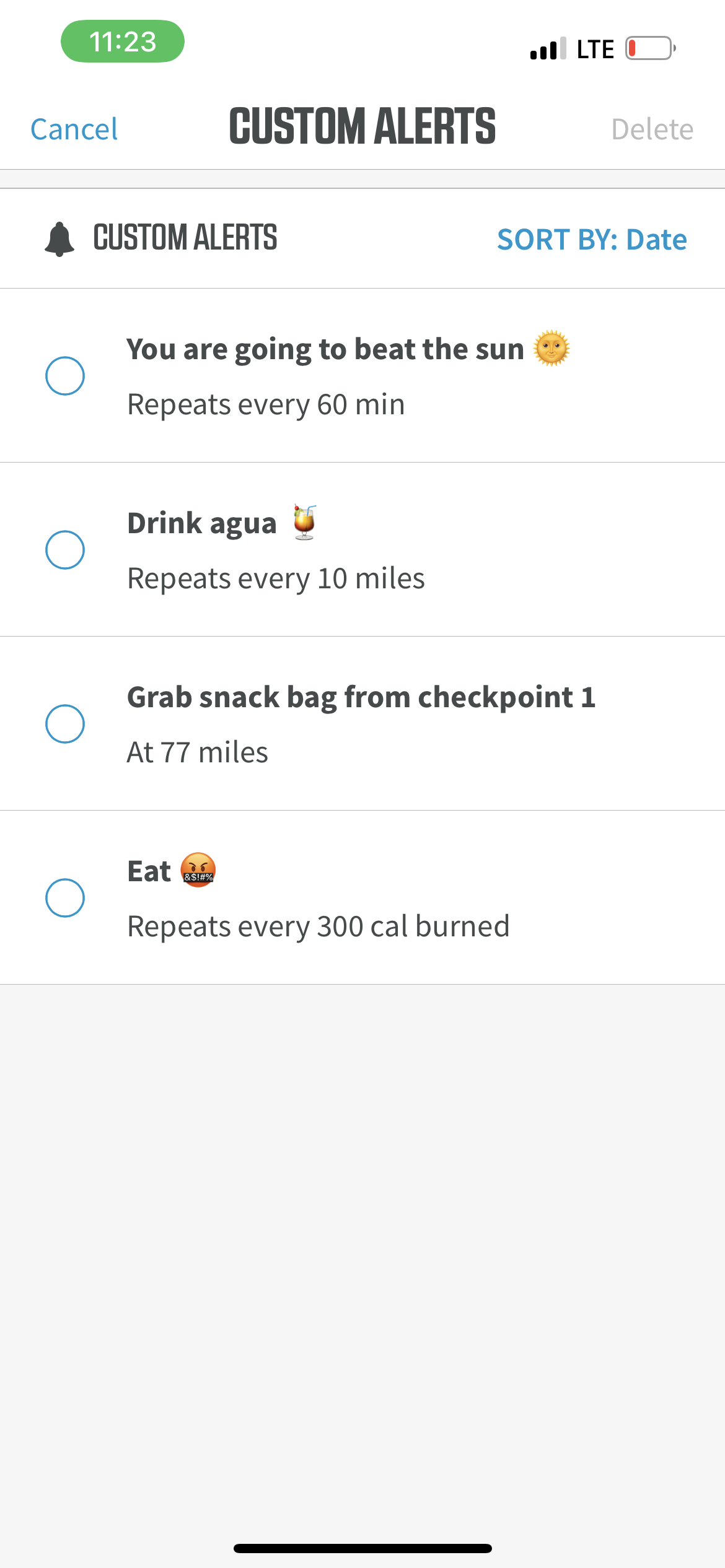
Toggle alerts on and off
Edit alerts
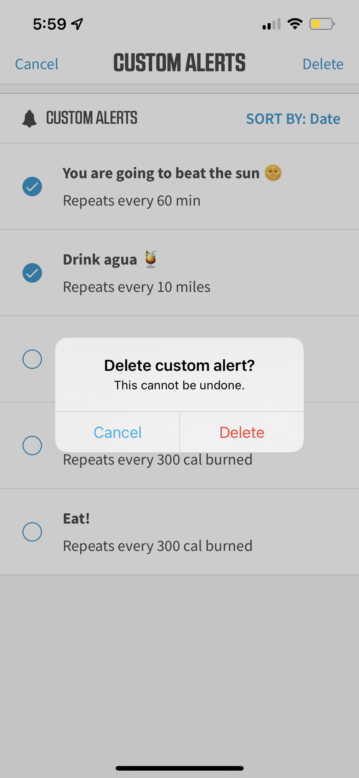
Delete alerts
Settings
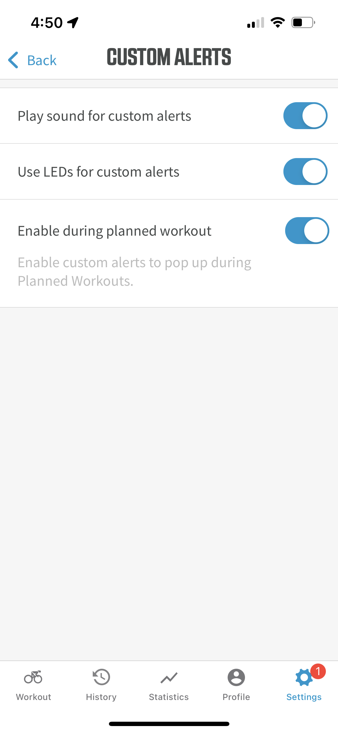
Enable sounds and LEDs
Add an alert
The most core piece of the experience — adding a new, specific-to-you alert. Simple is best.
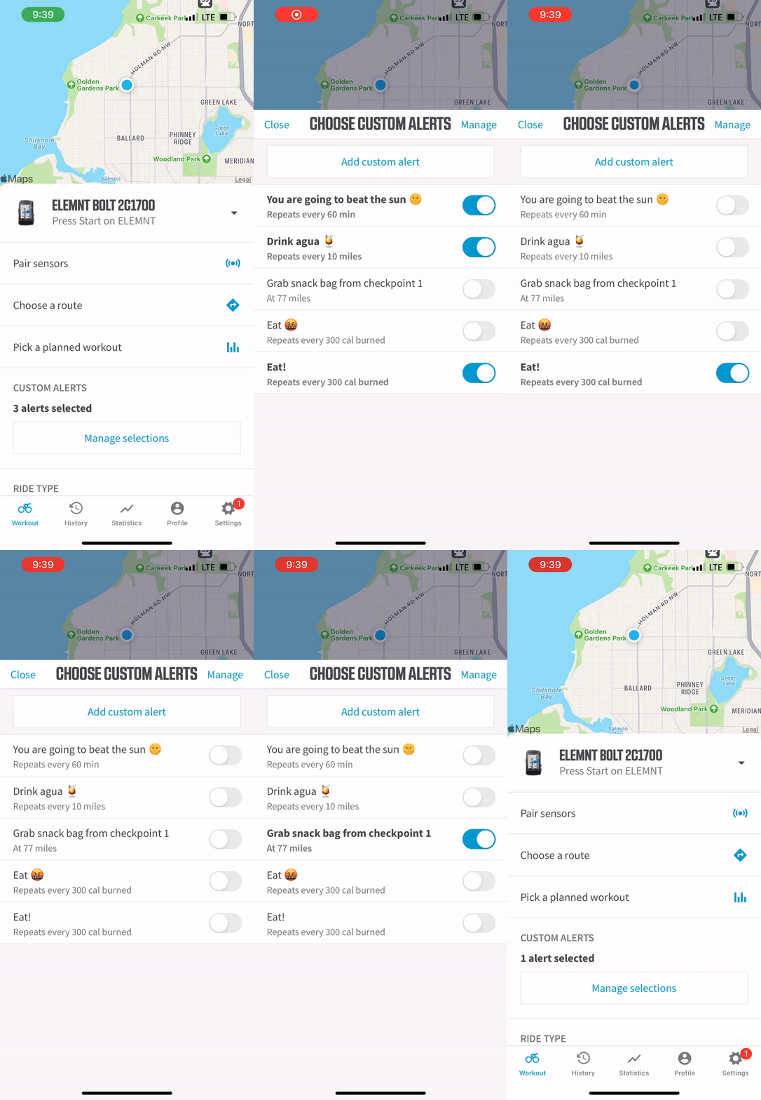
Via the Workout tab;
Select custom alerts
Manage selections
→
Main custom alerts modal
First time UX / onboarding
Main toggle on/off page
→
Create alert
Add an alert set to time, distance, or calories burned
→
Alert auto toggled to on;
Go for your ride!
Select custom alerts
Workout tab
First time onboarding
ModalAdd alert modal
ModalAll fields are required
ModalFirst time user experience — onboarding
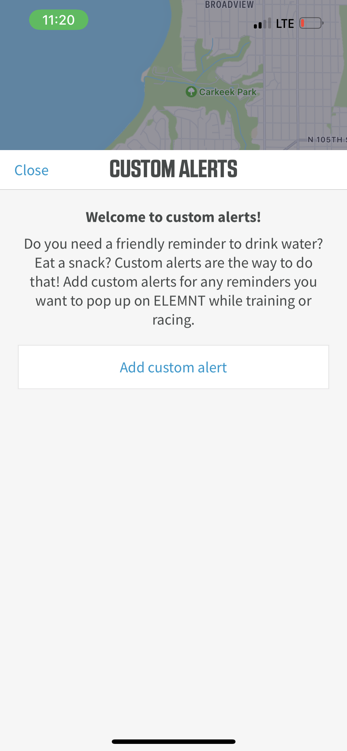
Previously our users weren’t able to add anything custom like this in the companion app. They were able to grab routes and workouts (but those were already made somewhere else).
For a first-time experience, I felt users needed some guidance as to how cool this is; example use cases and prompting to make it your own.
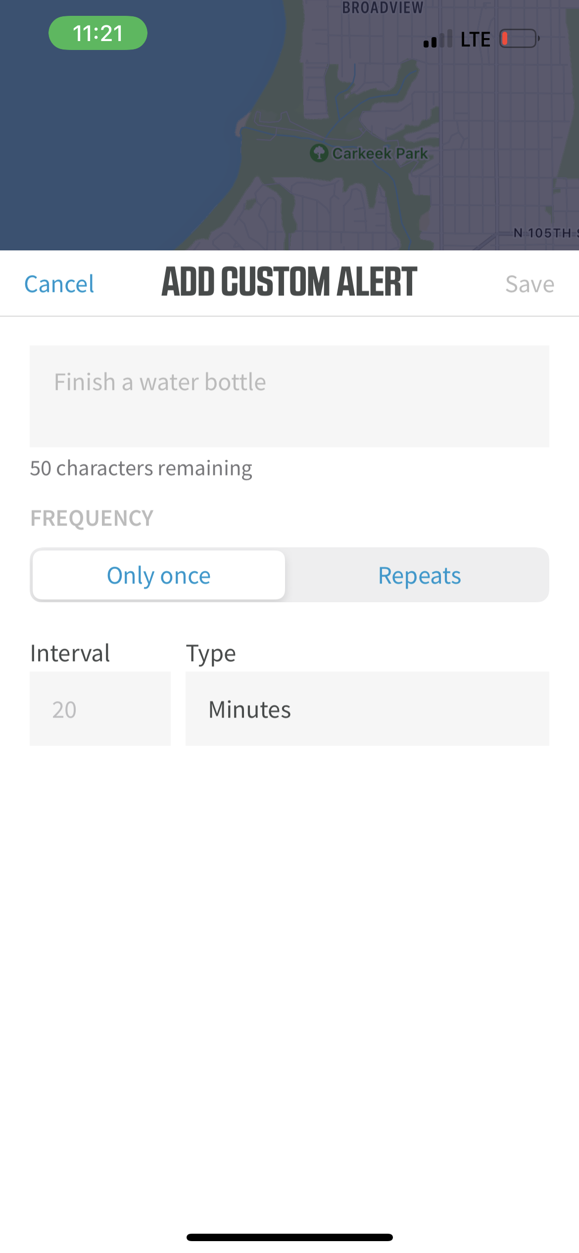
Add — bottom drawer modal
I iterated a lot with how best to organize & display the add custom alert content.
At the end of the day, a bottom drawer modal was the easiest to complete a full “add alert” in the least amount of time.
Proximity to the bottom of the screen for easy tapping
Not needing the full screen worth of real estate
Components of the bottom drawer modal
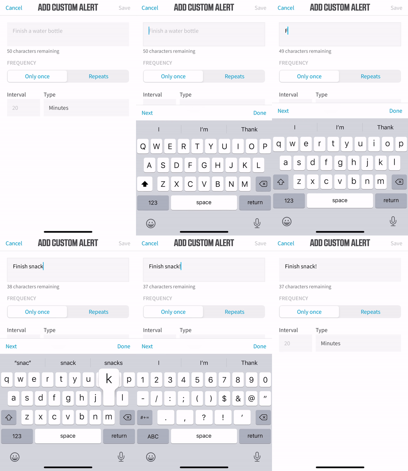
Limited text box
Our bike computers are compact; a character limit was a necessity. After trial and error, 50 chars was a good long message length.
Add a “ghost” message to the empty state (“Finish a water bottle”) to spur ideas.
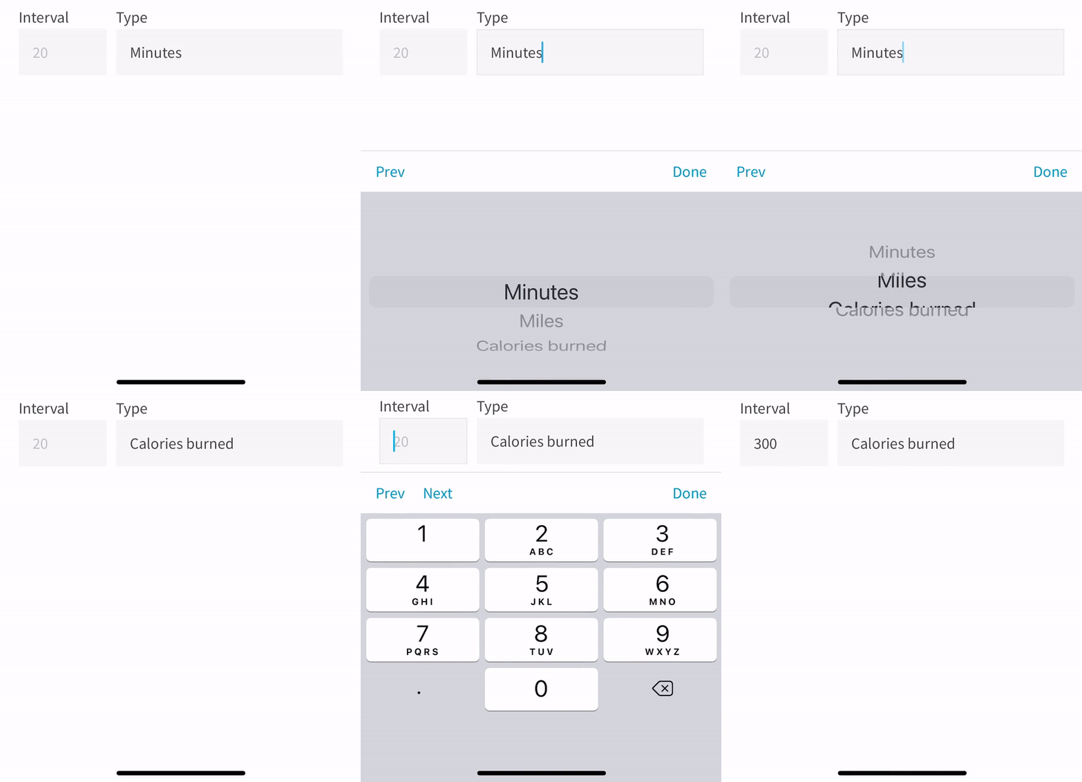
Interval field + type dropdown
Interval is limited to integers 0 — ∞ and brings up a number keyboard only. Decimals are allowed.
Type was designed as a drop-down — there is a huge possibility that more “trigger types” get added to this feature down the line. My goal was to make sure the feature pliable if subject to additions.
Frequency picker
After iterations (dropdown, changing the modal contents entirely for each of these options picked), selecting between a single or repeated fire alert was done best on a simple 2-up picker that didn’t alter the rest of the modal
Alerts set as “only once” will be parsed as [alert message] + “AT” + {INTERVAL} + {TYPE}
Alerts set as “repeated” will be parsed as [alert message] + “EVERY” + {INTERVAL} + {TYPE}
Manage selections
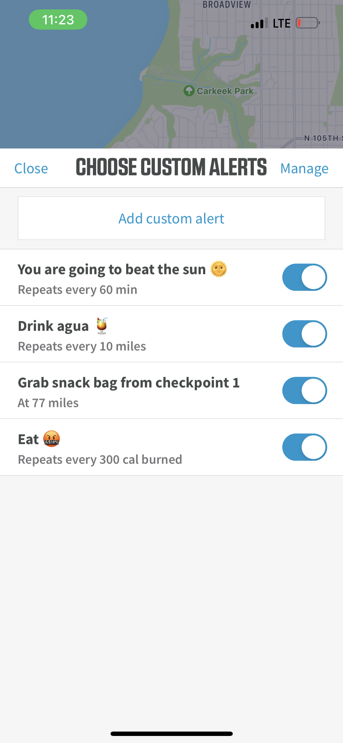
Alerts that you’ve created for yourself stay on this “choose” page unless you need to edit or delete them. It looks very similar to an alarms app.
The most common use case for custom alerts is a rapid on/off of pre-made alerts that a user needs for that specific workout or race.
By enabling a quick toggle for on & off, and stowing editing/deleting elsewhere, we saved the user a few seconds each time they go to use the feature.
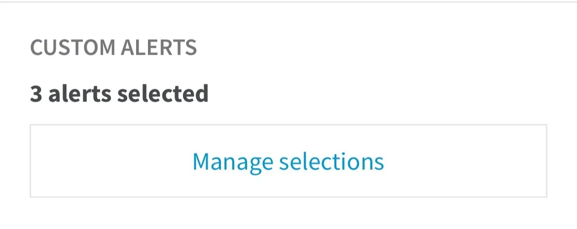
When a user has alerts toggled to ON they will see "X alerts selected" on their main workout tab
Edit alerts
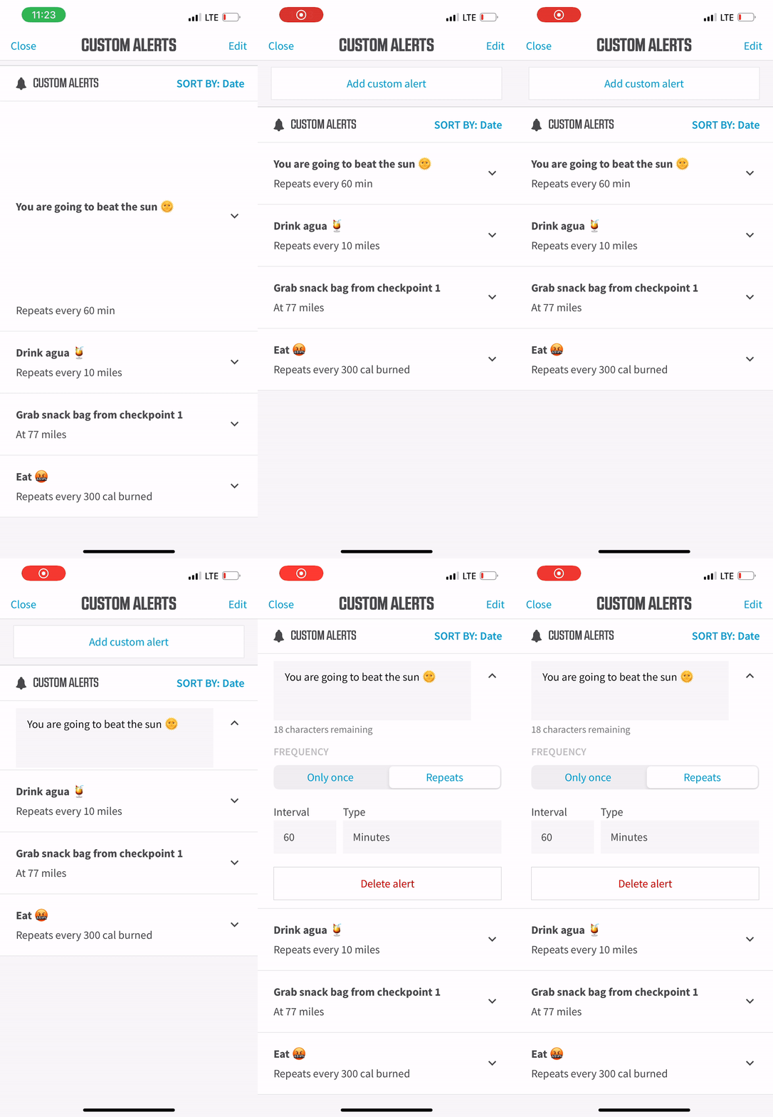
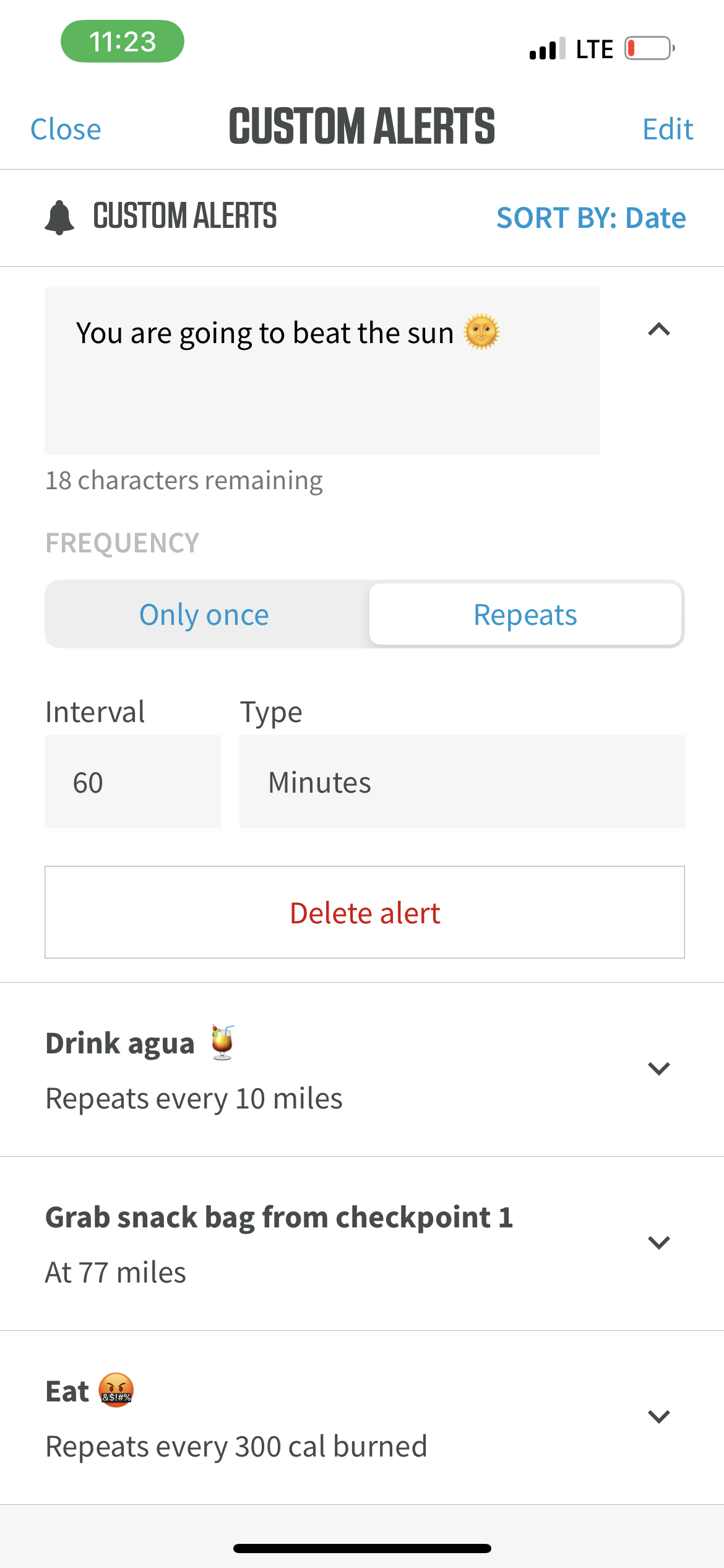
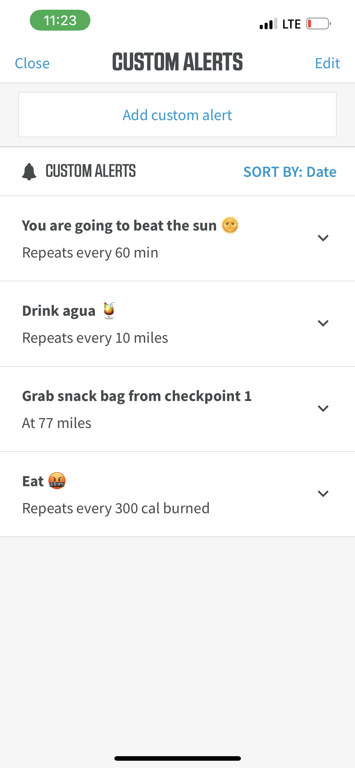
Editing in the “Manage” page allows for an accordion expand-and-collapse for each custom alert that allows each field to be edited in-line!
Edit message (expanded message box to fit the longest message possible)
Frequency picker (same)
Interval and type inputs
Delete button
I took a huge amount of inspiration from Android clock/alarms for this in-line editing behavior, mostly the repeat and day-specific alarm settings that are nested in the expand behavior
Accordion behavior
Alerts page — Manage button
ModalManage alerts — expands / collapses
Full pageIn-line editing or deleting
Full pageDelete alerts
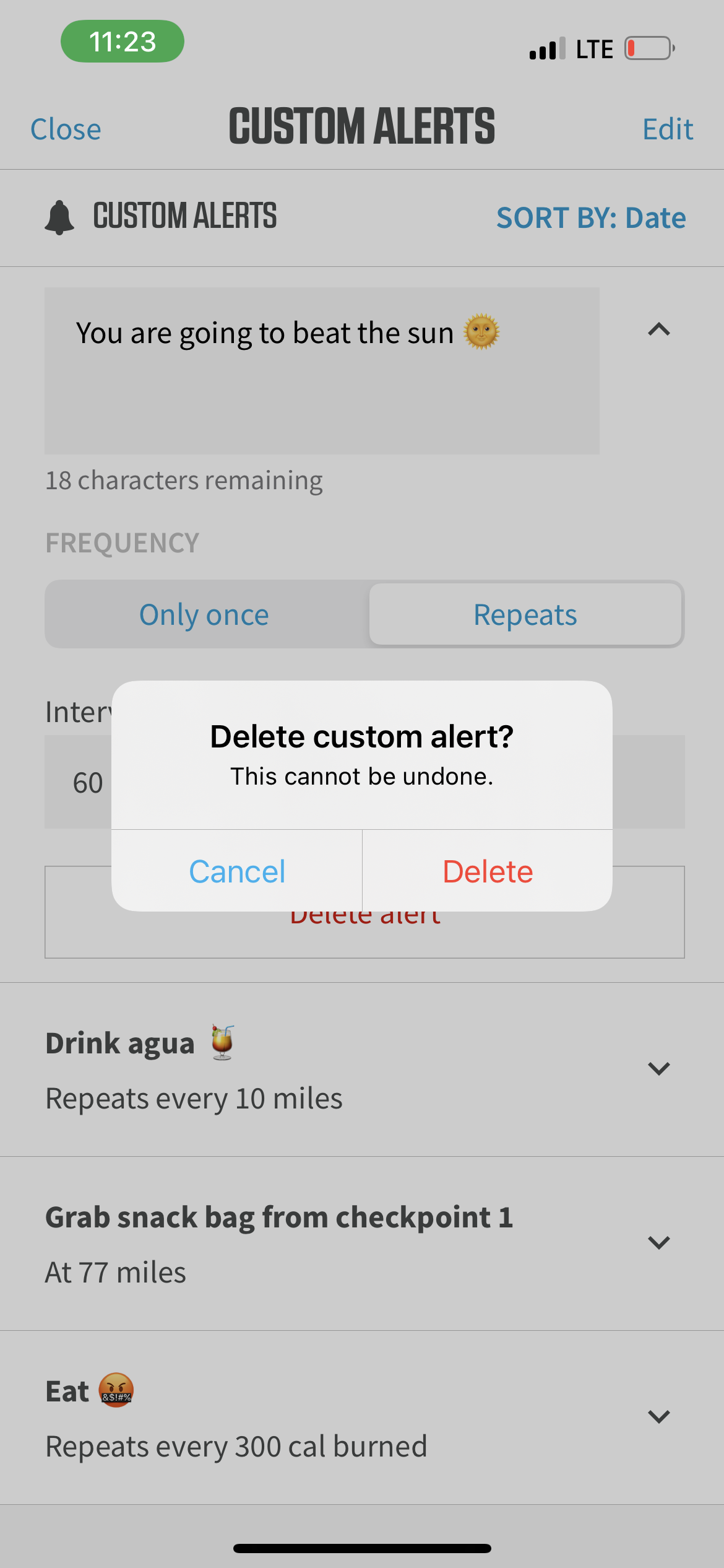
If you’re gonna edit in-line—you might as well be able to delete in-line.
Deleting an alert can happen in 3 different ways:
In-line delete button
Multi-select delete
Swipe to delete (iOS behavior)
Delete while in in-line edit mode
Delete en masse
Settings
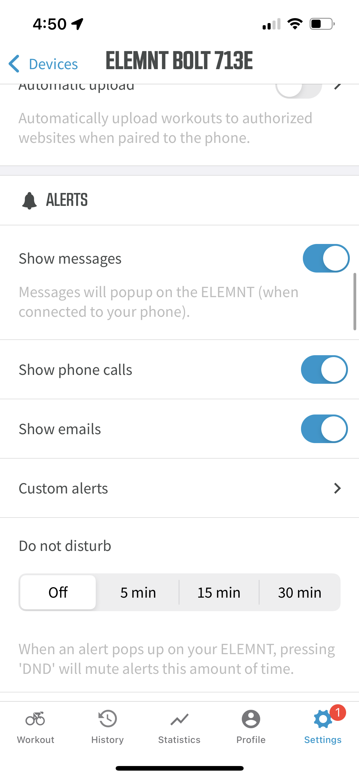
ELEMNT companion app already had a section under Settings for Alerts. This previously only including text messages, emails, and phone calls.
Adding custom alerts here made the most sense, but I nested it so that it had space for more multiple settings for the feature.
LEDS and Sounds
I decided to keep LED and sound patterns the same as a traditional notification (text) on ELEMNT. I feared adding a third notification sound (in addition to text and call) would be too much.
Nested under Alerts category
On the bike (computer)
Reminder: this device is not a touch screen!
Various sizes of messaging (50 char limit)
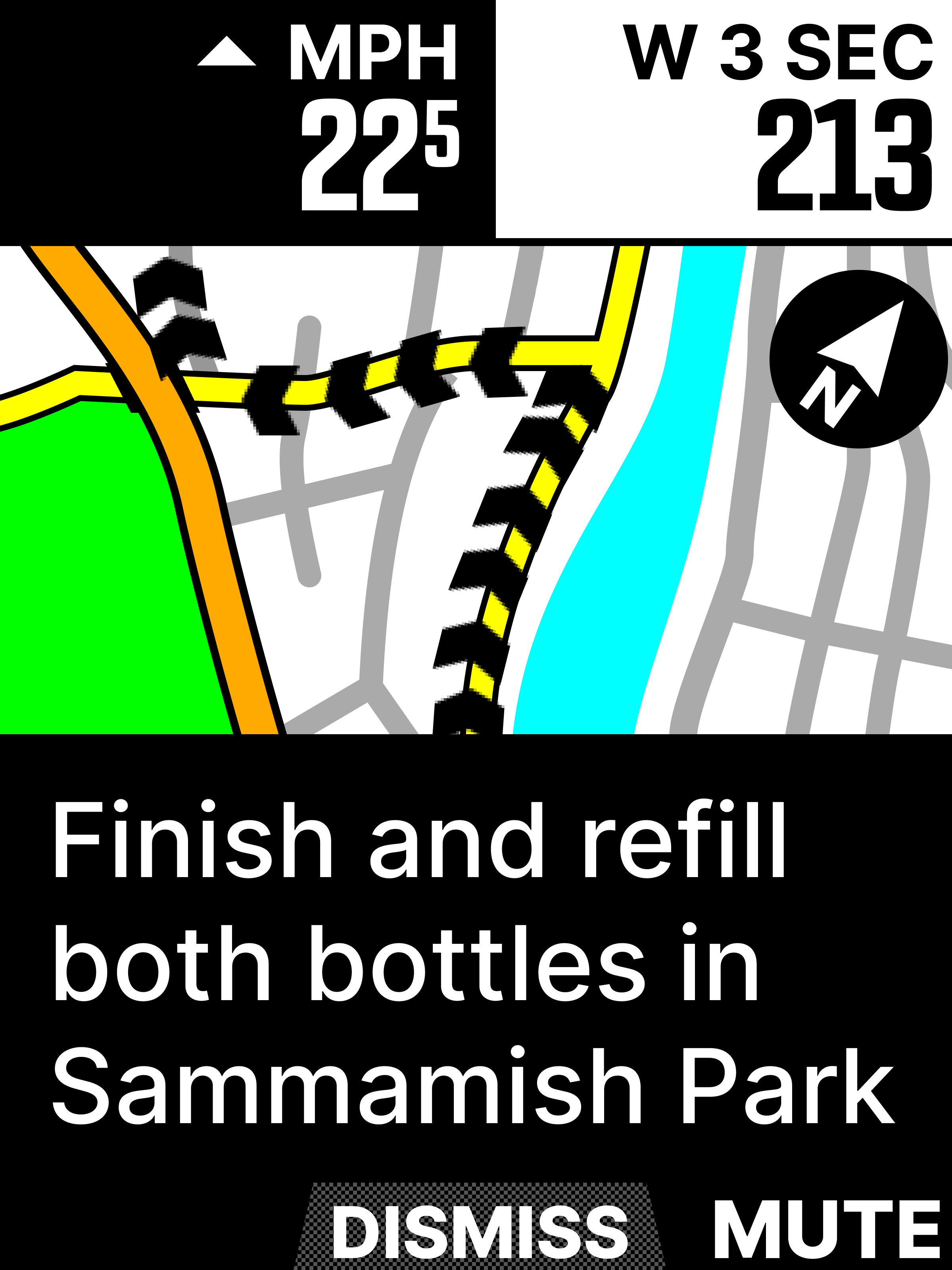
On an ELEMNT bike computer, the design requirement is for a notification of any type to only take up ~one half of the screen real estate, from the bottom.
Design on-device didn’t need to be complicated. It should follow what notifications already do, and then dismiss/mute behavior should be its own mini-feature.
50 char limit across all devices
While designing for this feature, I needed to set a char limit for alerts. Comparing to our smallest font size on each device, I found the char limit was a healthy 50 chars on each.
I set font size requirements for all lengths of messages across 3 devices (ROAM, BOLT, BOLT 2.0, ELEMNT).
This alert is 49 chars, 1 below the limit
**All bike computers had specced requirements for hand-off, but speccing predominantly for the top of the line / newest model was important since BOLT 2.0 is the only full color device and the device font book has the most updated emoji range.
Bolt 2.0
The in-ride experience
Alerts toggled to “on” on the companion app are ready for a workout.
Once the “START” button has been pressed, all counters are turned on. TIME is accruing, as is DISTANCE. CALORIES are calculated using the appropriate datapoints.
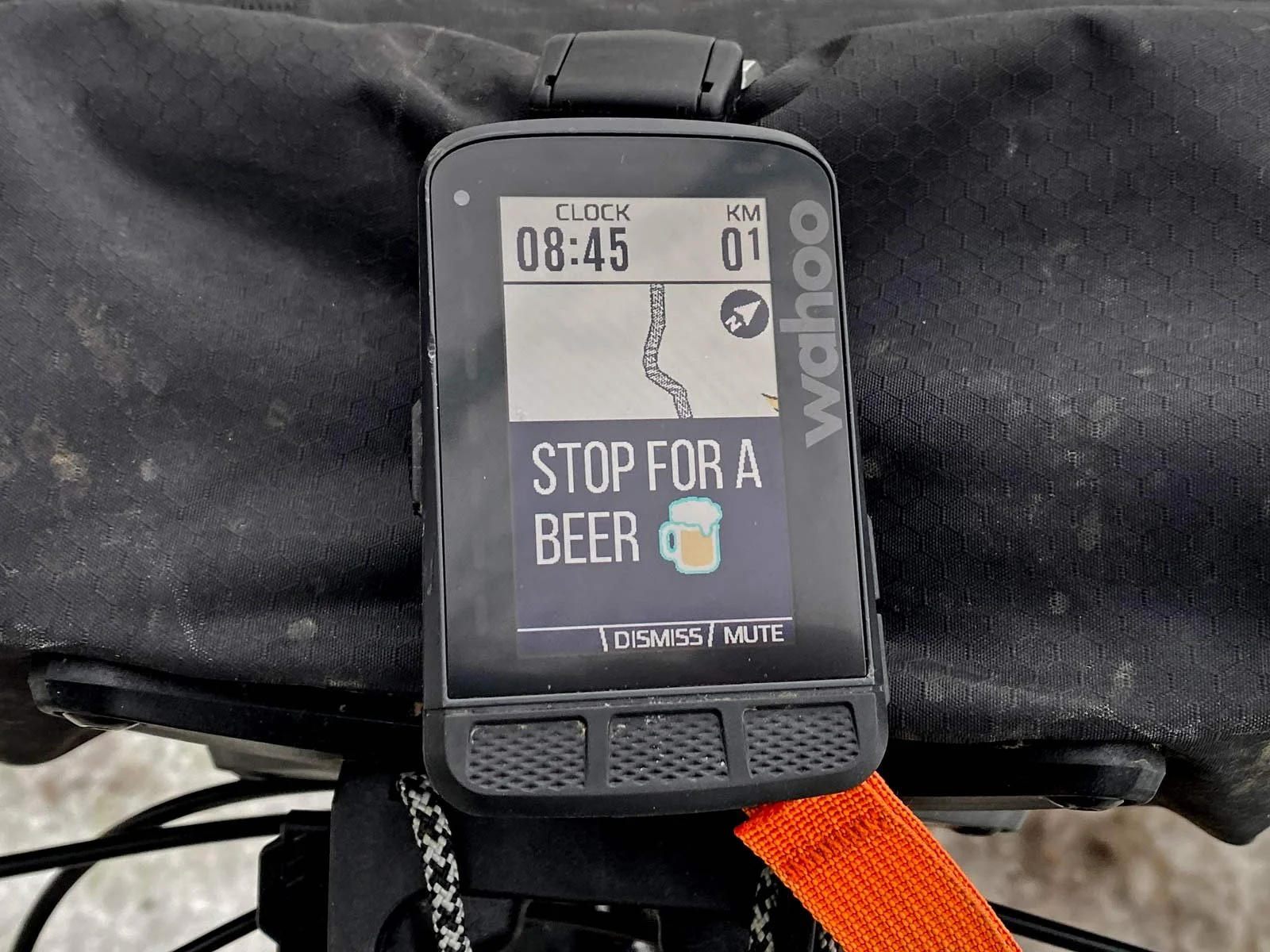
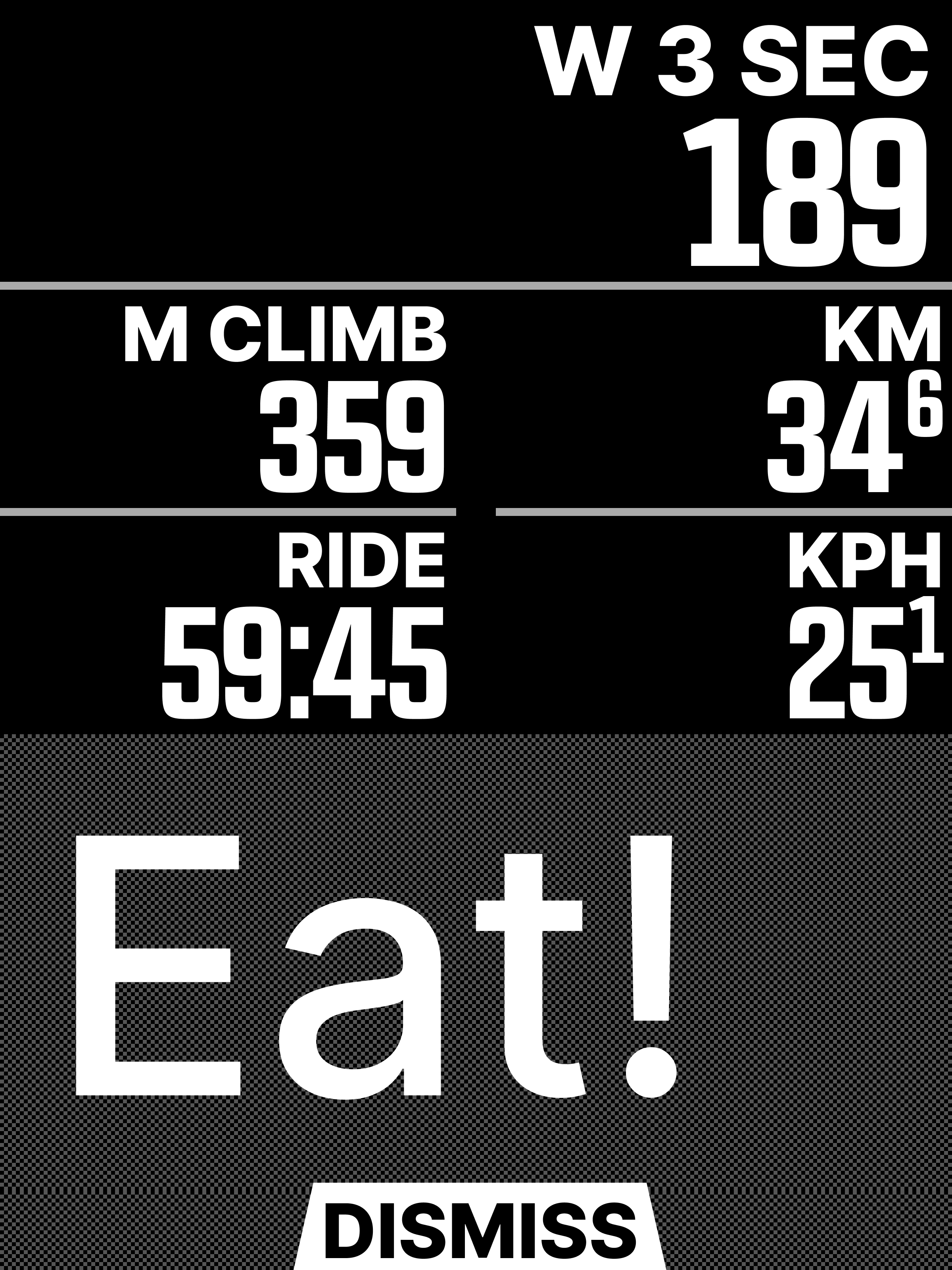
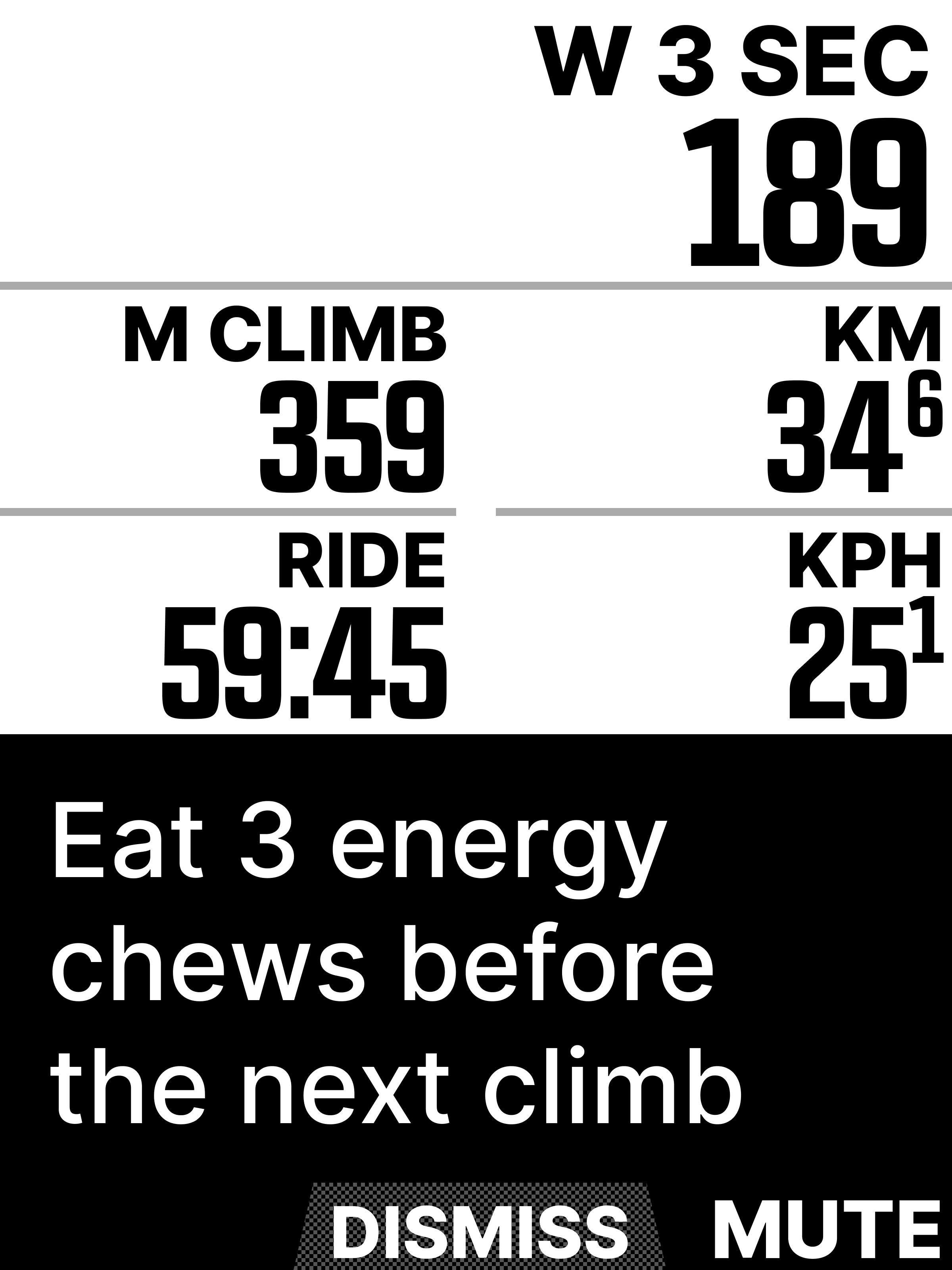
YAY! An alert counter has accrued the amount set. Alert fires and displays message, LEDs flash, piezo buzzer goes off.
Alert message stays on-screen with no set fade time.
User must manually dismiss alert in order to get it to disappear.
Alerts stack on top on one another if not dismissed.
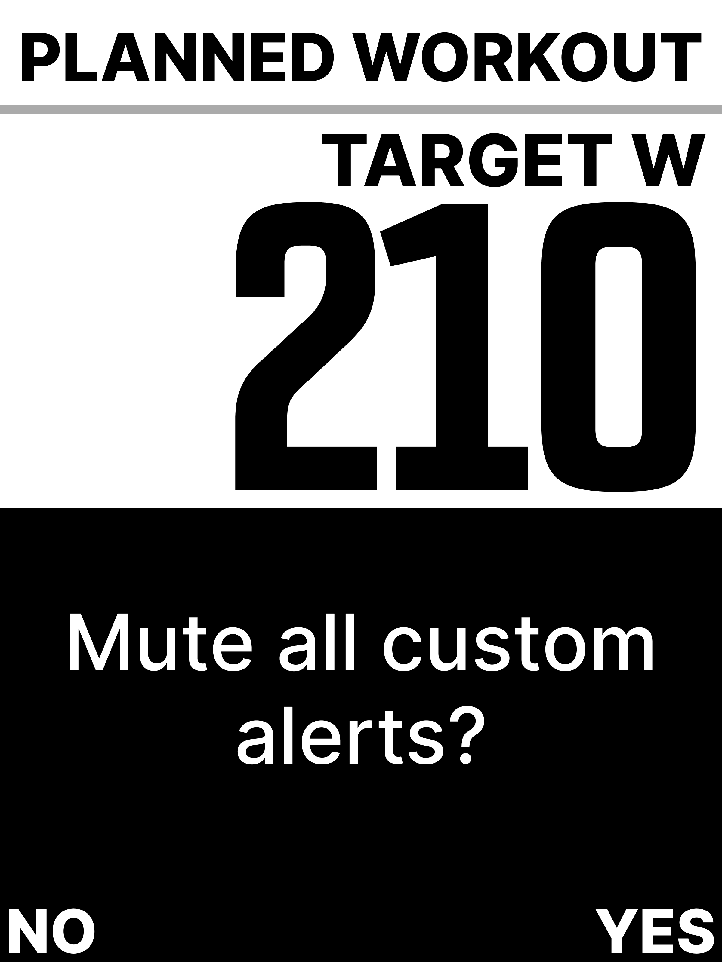
If a user MUTES alerts, no alerts shall fire. Counters are still accruing. User confirms muted state.
If a user sets alerts back to ON, they will fire back on accrued cadences. No past alerts will fire.
If a user finishes a workout with alerts MUTED, that state is persistent for their next ride.
Mute versus Dismiss
Early iterations of custom alerts had global “off switch” in the companion app. I thought of it as a bunch of small switches, with one big kill switch commanding all of them.
After dev reviews, we decided a switch hierarchy wasn’t intuitive.
The concept was still good to have; it just belonged somewhere that wasn’t in the companion app. It belonged on-device instead, serving as a MUTE button, with a DISMISS for each alert.
Any alerts set to MUTE will not fire (message will not appear, LEDs and sound will not flash/play). However, alert counters still accrue in the background, should the user turn alerts back ON.
Mute
Muted alerts do not fire but remain on their counter (++)
Dismiss
An alert stays until dismissed
Dismiss Feedback
When racing, a user that receives an alert is often not able to acknowledge it until they’re in a safe setting to do so. For example, a Mountain Bike racer descending downhill. They will be able to execute on the alert (i.e. eat snack) once they’re on safer terrain. Because of this, I decided to keep alerts present UNTIL dismissed manually.
I’ve heard mixed reactions about this from users after launch. This style of present-until-dismissed behavior is really novel to our users. Everything prior to this had a fade counter.
I do think bringing a setting in for this in future iterations is important. It very much should be up to the user what the dismiss cadence looks like, if at all. For V1, it made sense to bake persistence into the feature. I would imagine this is in users’ hands in future versions.
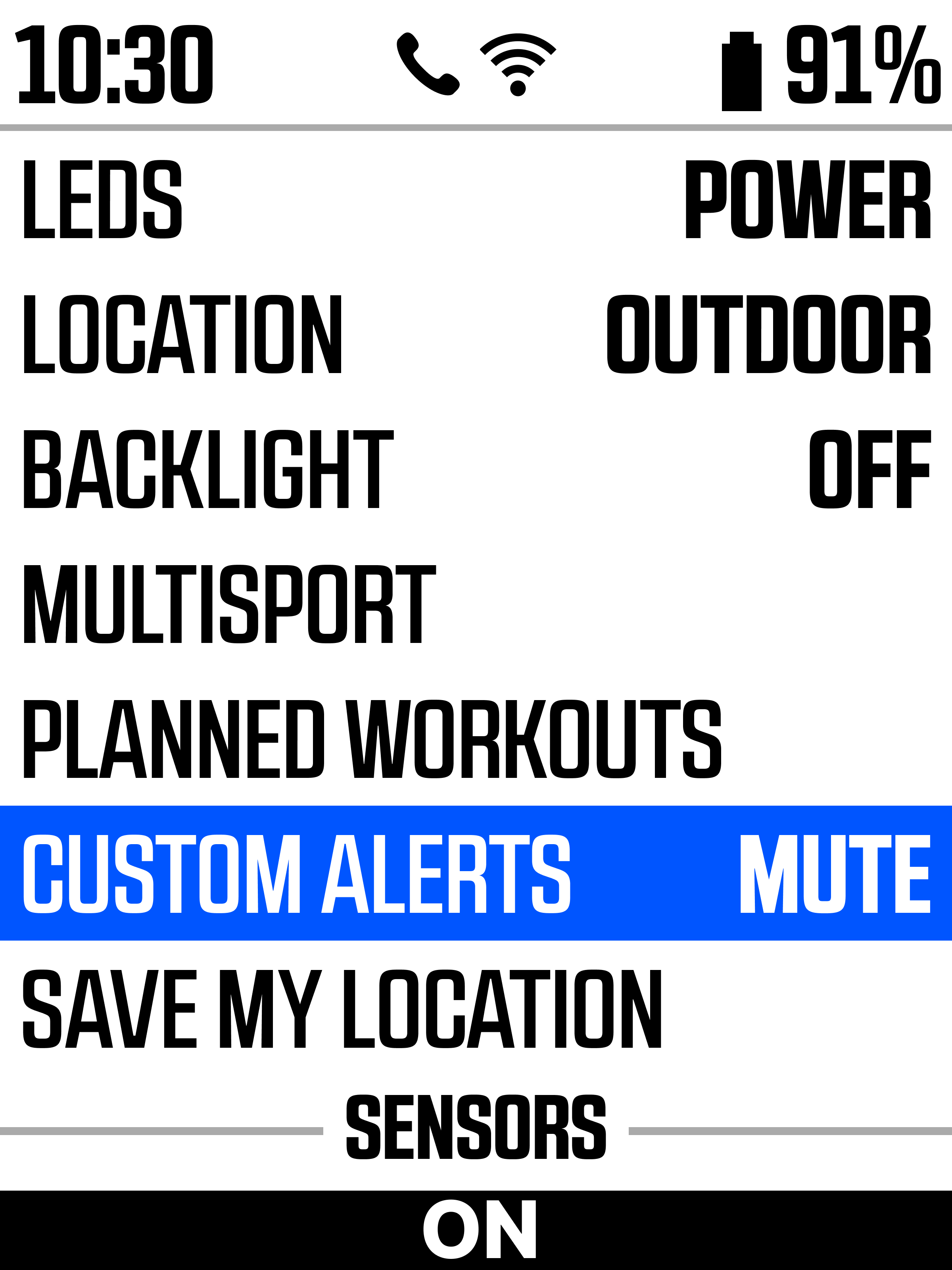
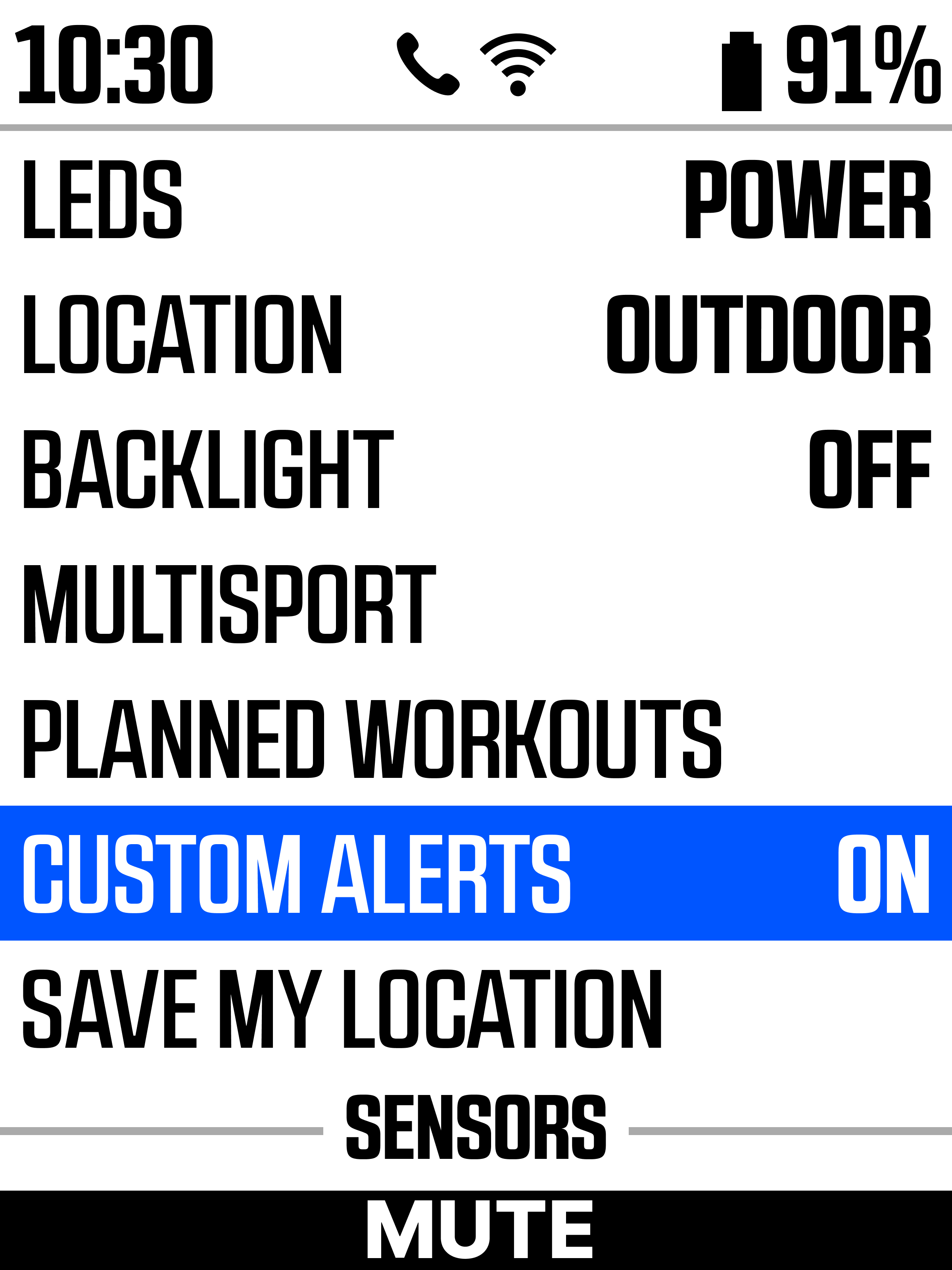
Mute via Settings
MIDDLE BUTTON PRESS to toggle between these two options
Testing
Without going into too many details, this feature was relentlessly tested with the dev team to ensure alerts created & toggled to ON were immediately available on ELEMNT for a workout
I also tested the feature on my own rides (pretty much daily) and dabbled with edge cases. Those included:
MILE 0 or MINUTE 0
I.e. “I want an alert as soon as I start my ride”
SMALL DISTANCES ACCRUED
I.e. “I want an alert every .1 miles”
I needed to test how these stack / fire at micro-cadences
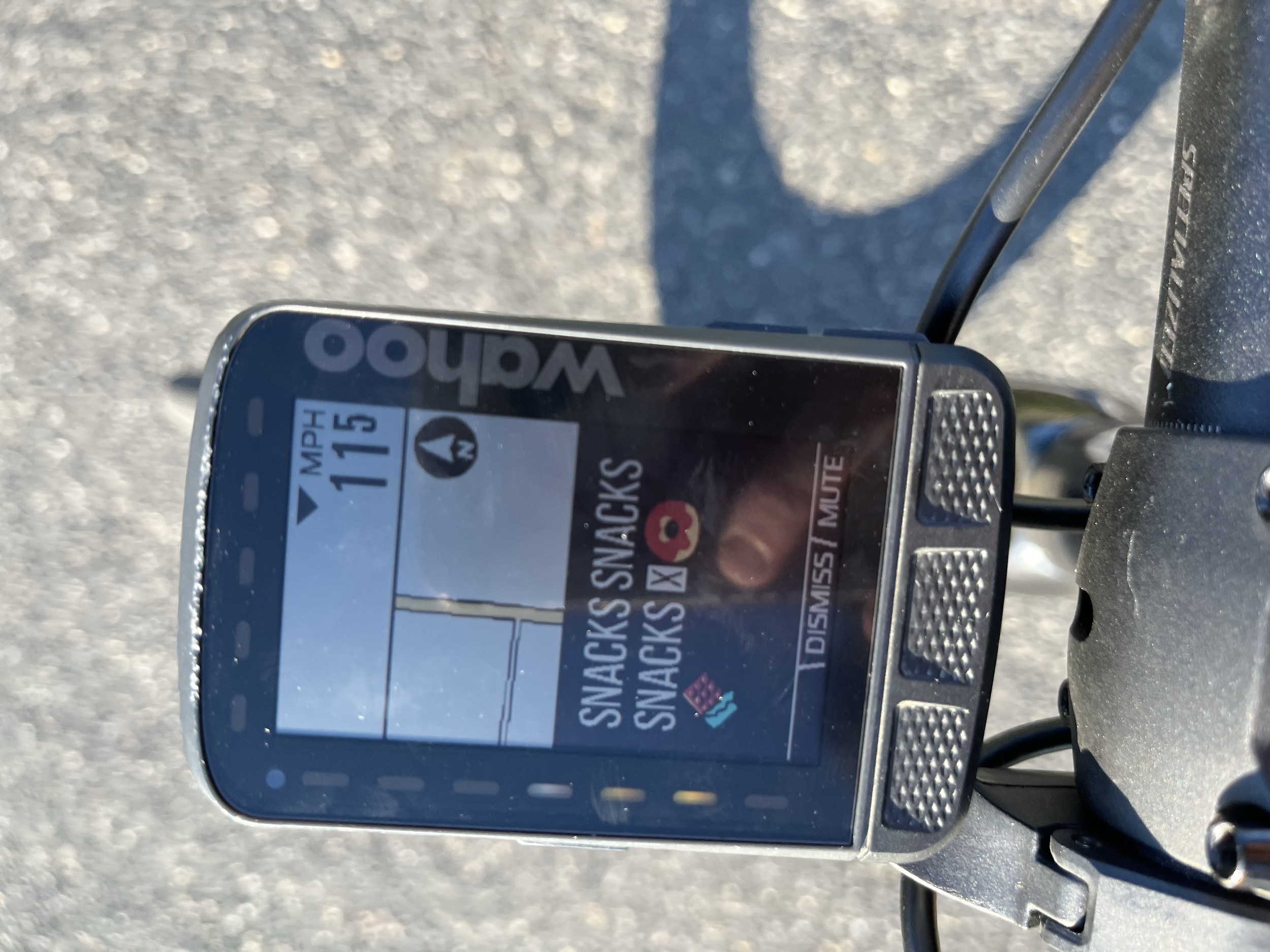
The case for emojis 🍕
Use cases aren’t always what you think!
I remember early on showing the dev team an EARLY iteration of custom alerts on iOS/Android. The first thing they saw was a line that said “Eat two cherry 🍒 gels”
Naturally, their first response was to ask me about it. Are emojis really a requirement for this? Yes. From the beginning, I always knew emojis would start to play a huge role in custom alerts. It’s just a natural part of human language at this point.
It’s extra dev lift, so it’s extra time. But does it feel good? Heck yeah it does! You set these alerts up for yourself, so they might as well be memorable.
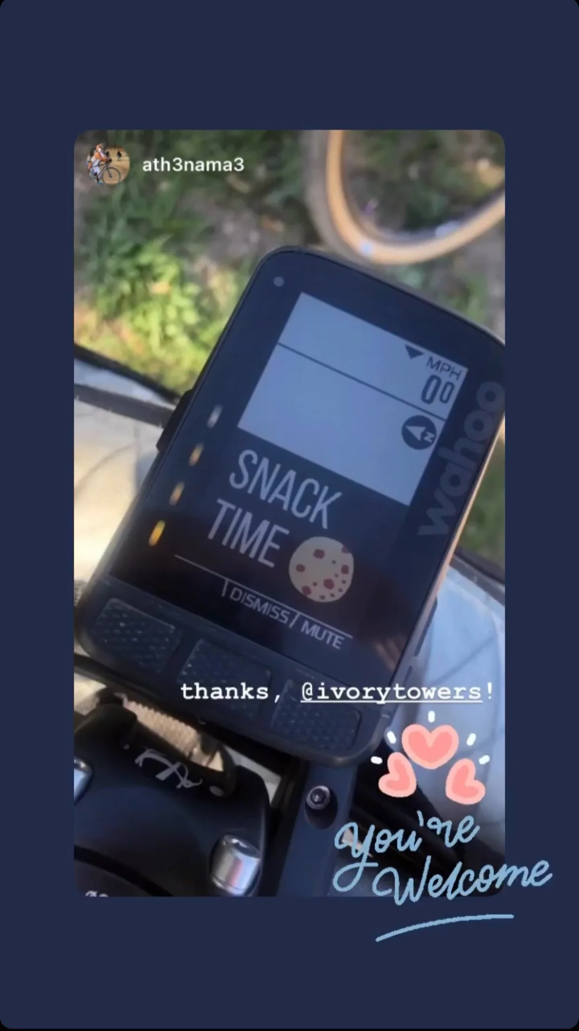
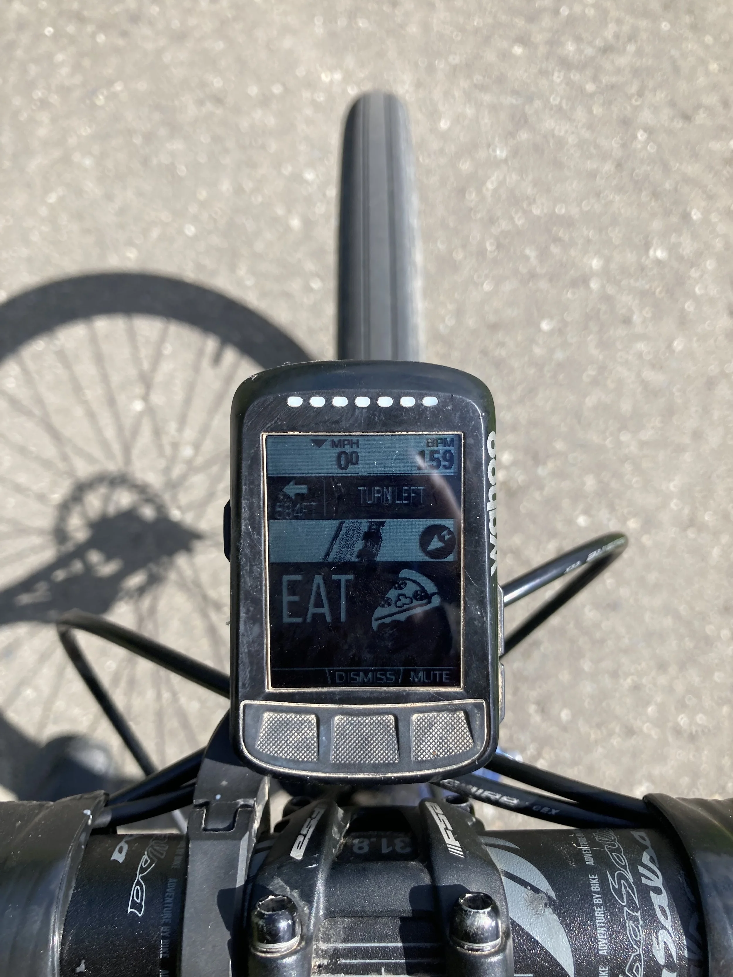
Designs out in the world
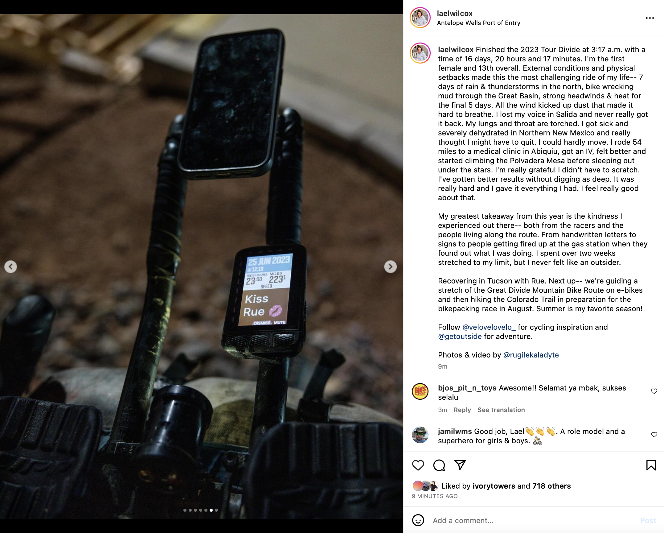
My favorite custom alerts IRL - ultra endurance bike racer Lael Wilcox has a custom alert to kiss her wife, Rue.



Impact + learning
I have truly never done a project that has been in the hands of so many — especially friends and athletes I ride with.
This project taught me so much about give and take and how that plays into the iterative process. It took a lot of trial and error to create the most simple experience possible, and that was with the help of stakeholders, developers, and users to inform what worked and what needed polish. I’m so grateful the feature was brought back to the drawing board after the first real iteration. The feature improved drastically and it was important to take that much needed step back away from how close I was to the work.
I use the feature in my own life/riding, so it’s even more important to me that things just work out the way they were intended. And what a wonderful job everyone did on this!
I can’t wait to see what the team does for this feature moving forward.


